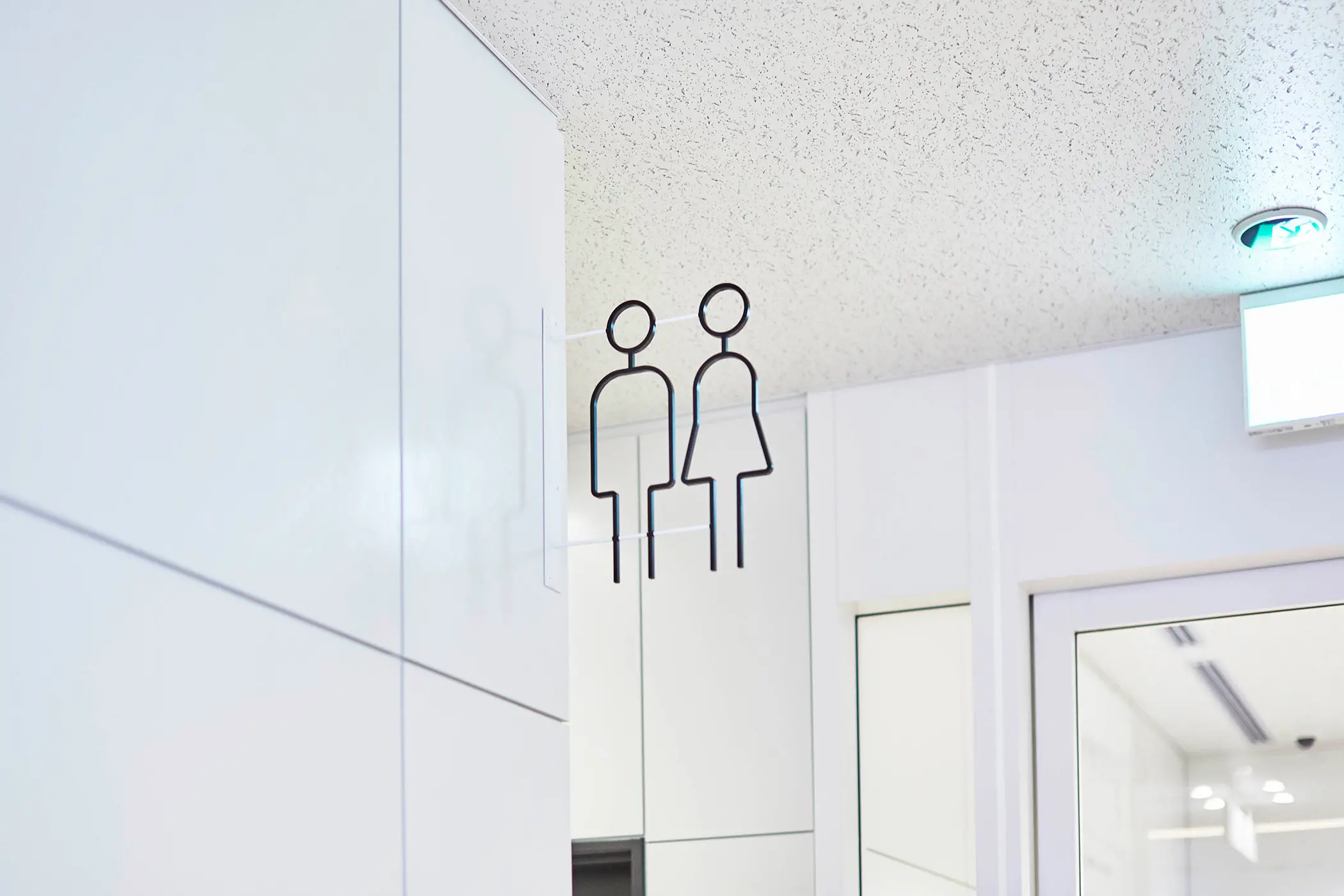
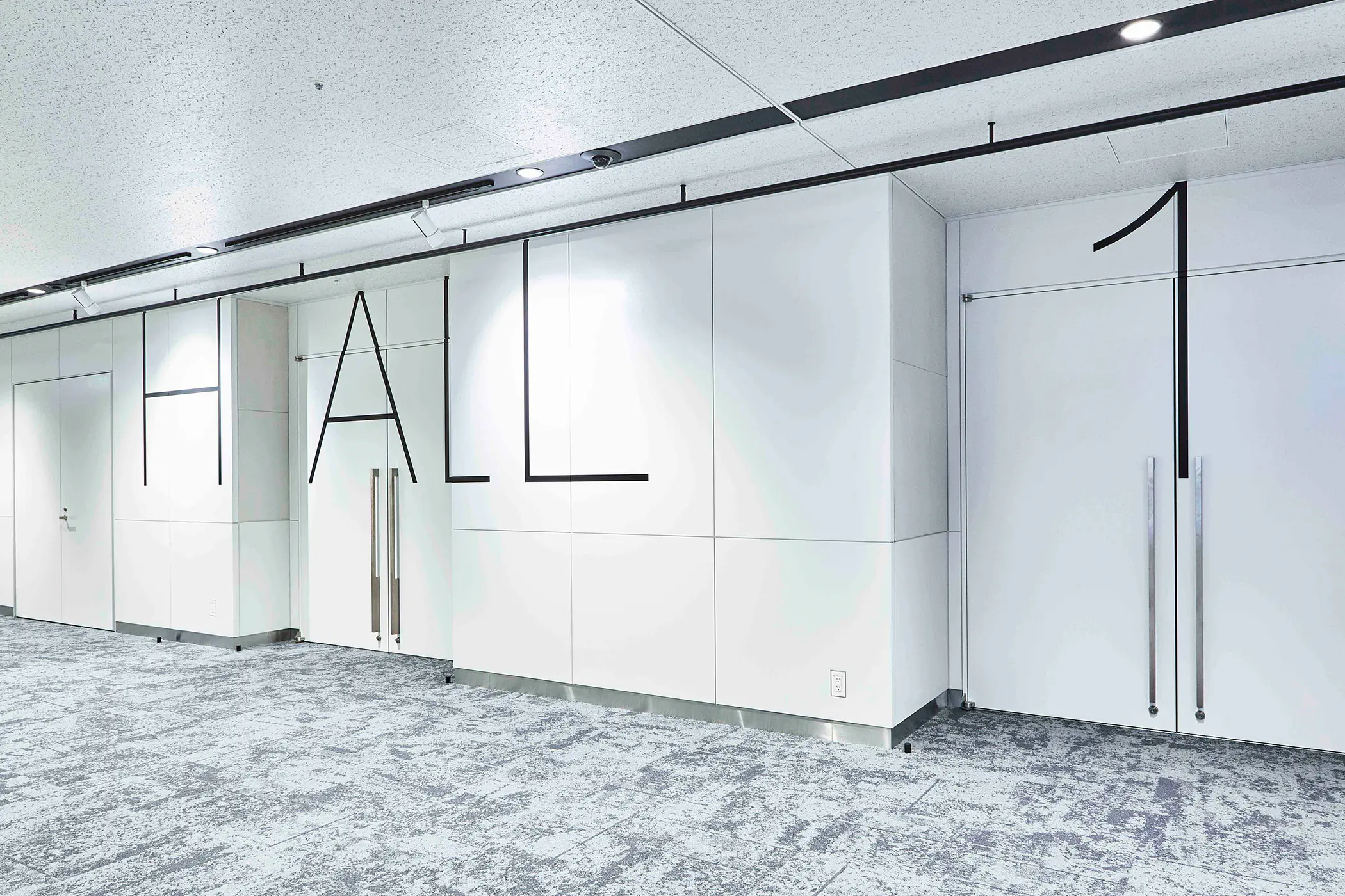
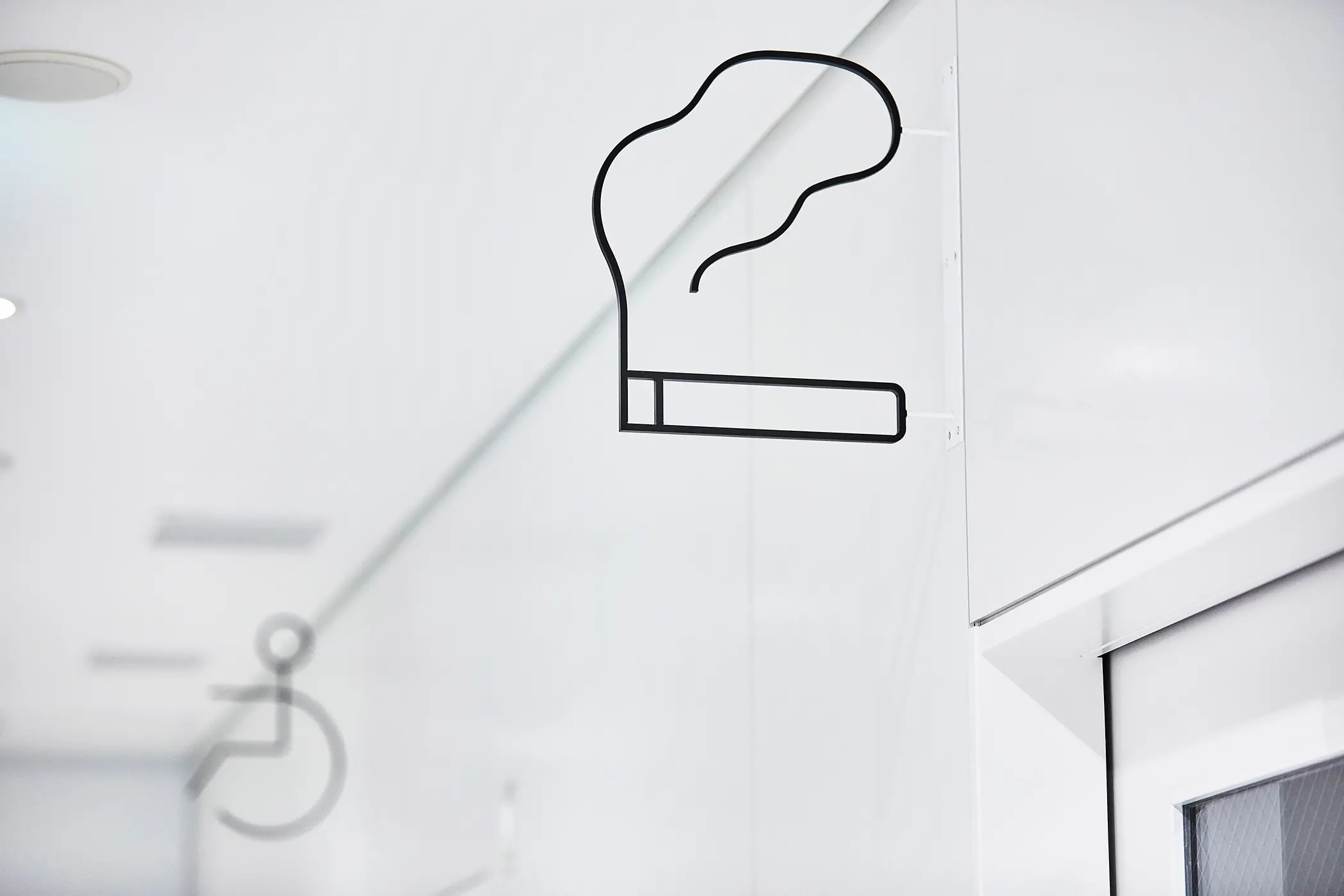
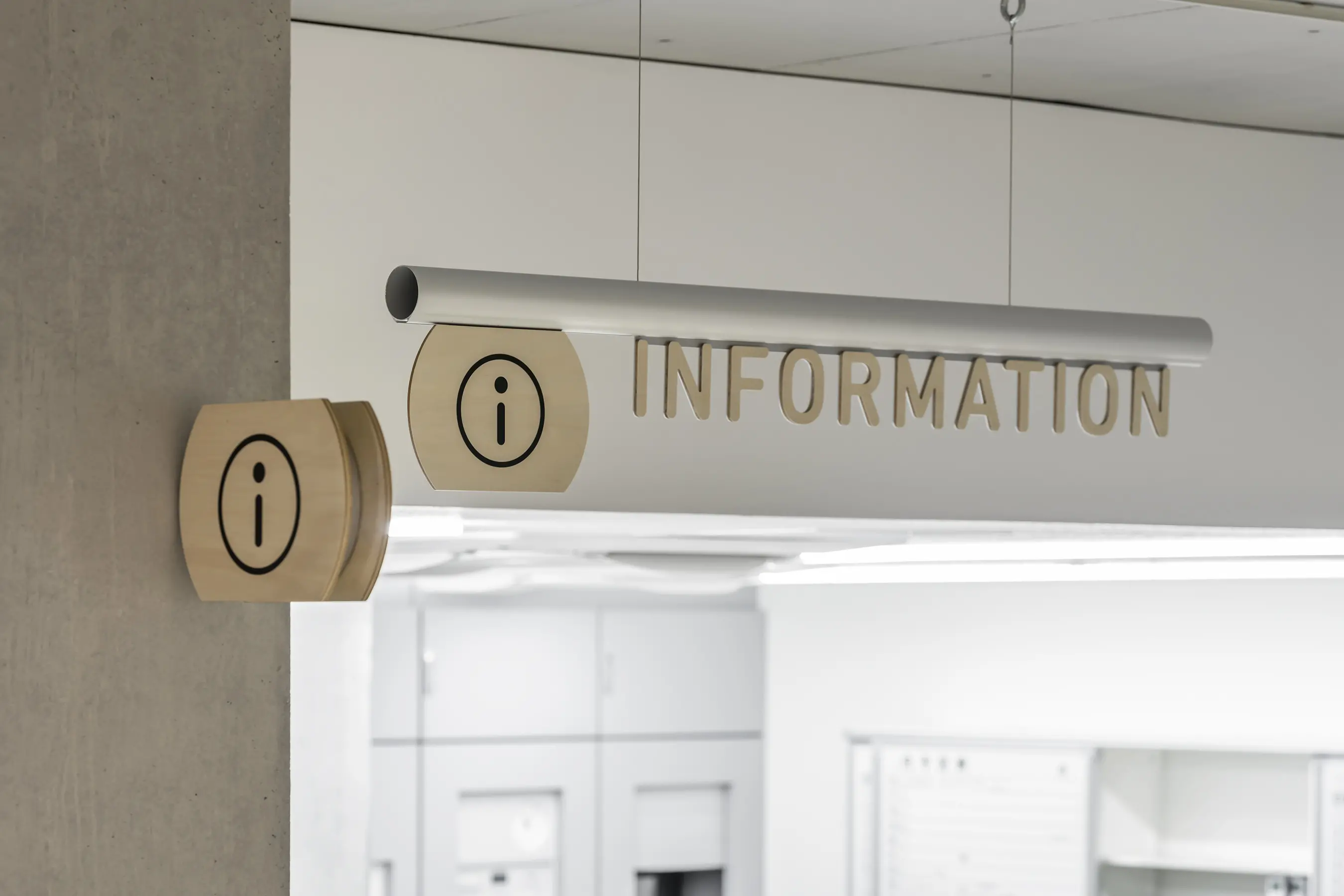
クリニックということや、高齢の方の利用が多くなることを考慮し、サインとして掲げる情報自体はなるべく大きく視認性を担保する必要がありました。
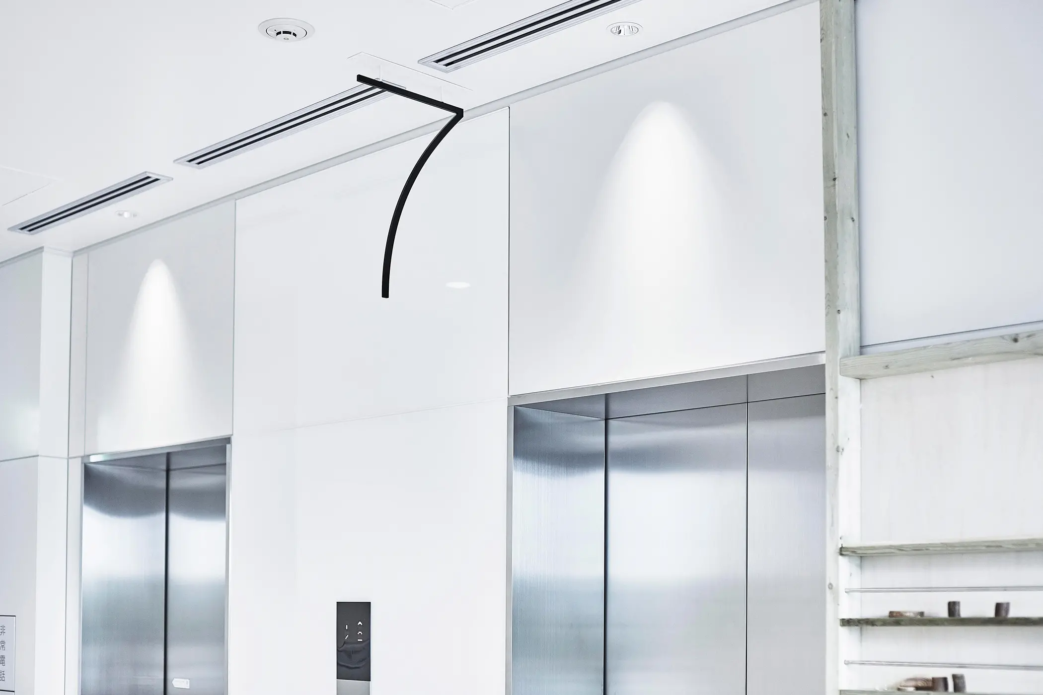
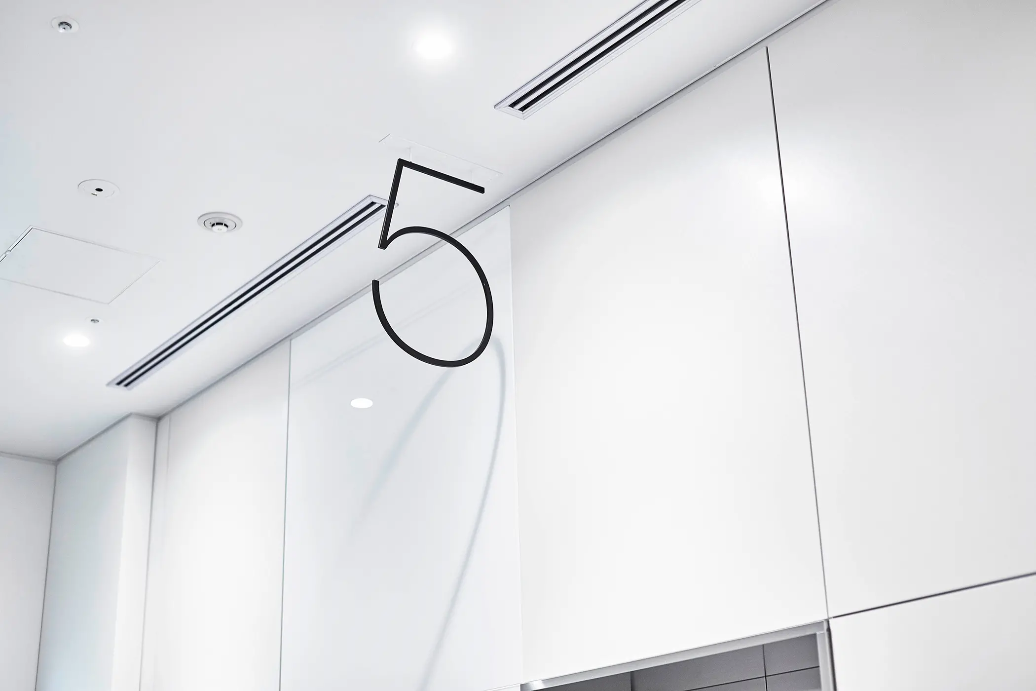
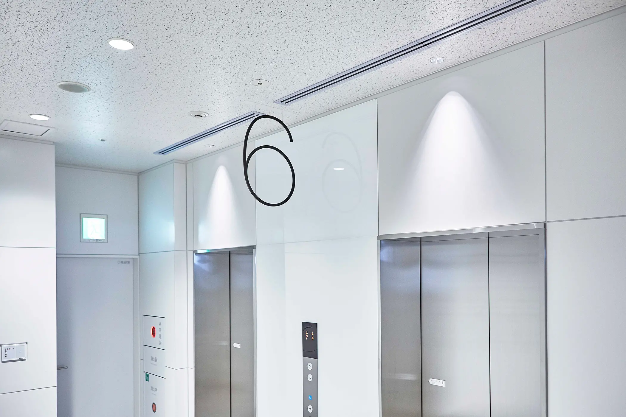
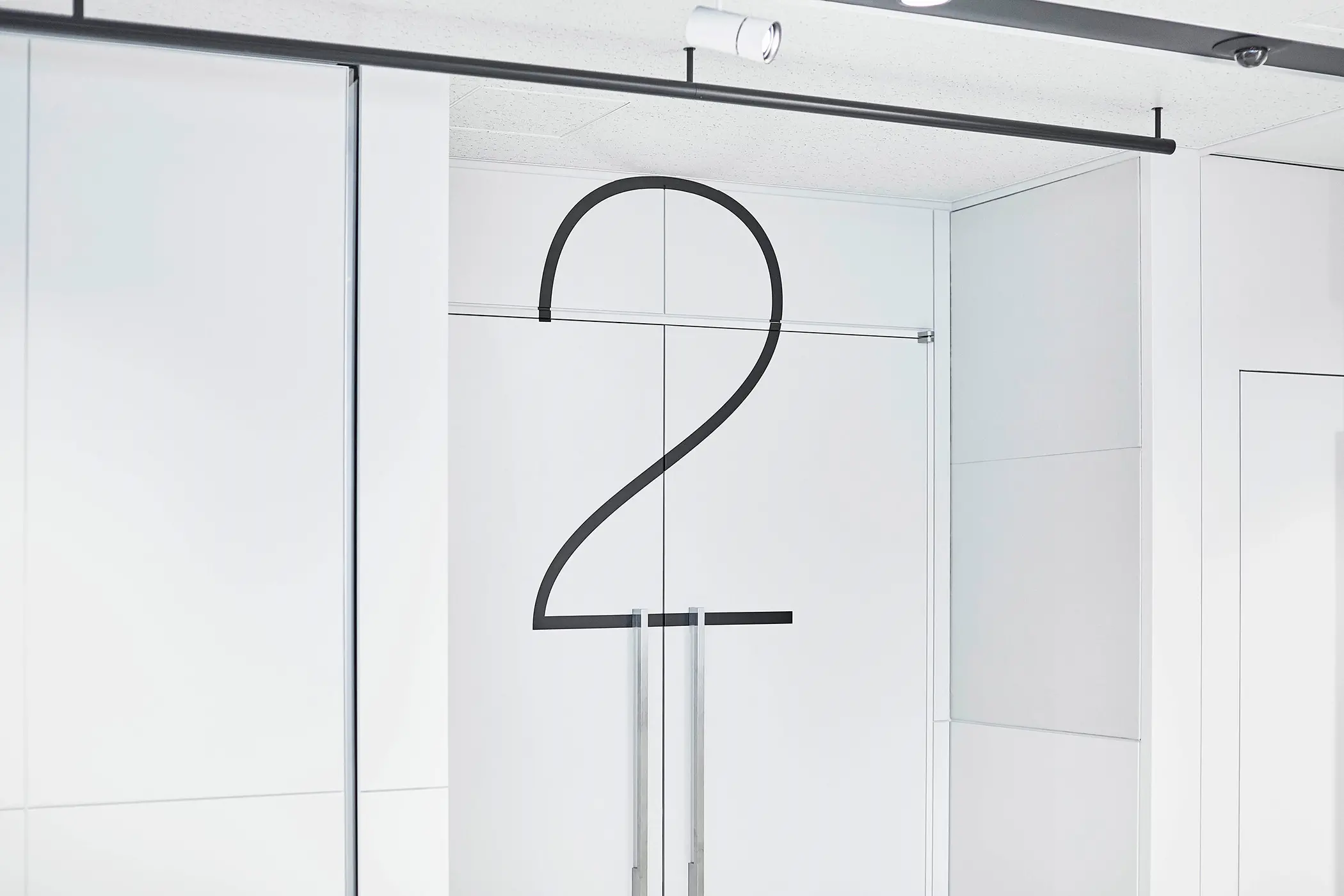
八木惣一郎氏 @s_yg デザインによる建築がとてもシンプルでディティールに拘って設計されているので、外の看板同様、サインが建築を邪魔しないように、大きな切り文字を用いて情報だけが空間内に浮いているように見えることを意識してデザインしました。
これらは5mm厚のスチールで、文字の太さも5mmの切り文字、高さは300mm程度に抑えて仕上げました。
結果、きちんと情報を伝えながら、空間の邪魔をせず、場所に馴染むサインができたと思います。
自然豊かな蓼科に新しく出来たライフクリニック蓼科のVI、サイン計画を担当しました。
As a clinic which serves elderly visitors, we also considered it was important to convey information and signage in a large and clear format, without compromise to its tranquil settings.
The architecture designed by Soichiro Yagi @s_yg was very minimal, and designed with attention to detail. So we felt that that simple information can be designed as large letters, which would ‘float’ in the spaces so that our signage can compliment with the architecture.
We were delighted in creating signage designs which were well-suited within its surroundings, whilst being able to convey information clearly and properly.
作为一个为老年人服务的诊所,我们也认为在不影响其宁静环境的情况下,以大而清晰的格式传达信息和标志是很重要的。
由Soichiro Yagi @s_yg设计的建筑非常简约,设计注重细节。因此,我们认为简单的信息可以设计成大字母,它们可以“漂浮”在空间中,这样我们的标识就可以与建筑相辅相成。
我们很高兴能够创造出适合周围环境的标牌设计,同时能够清晰而恰当地传达信息。