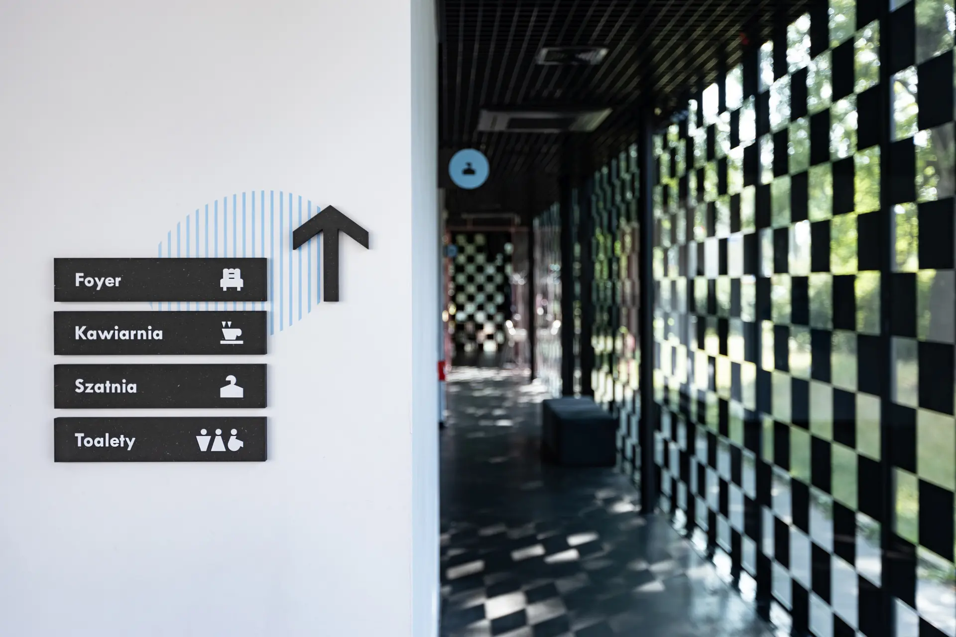
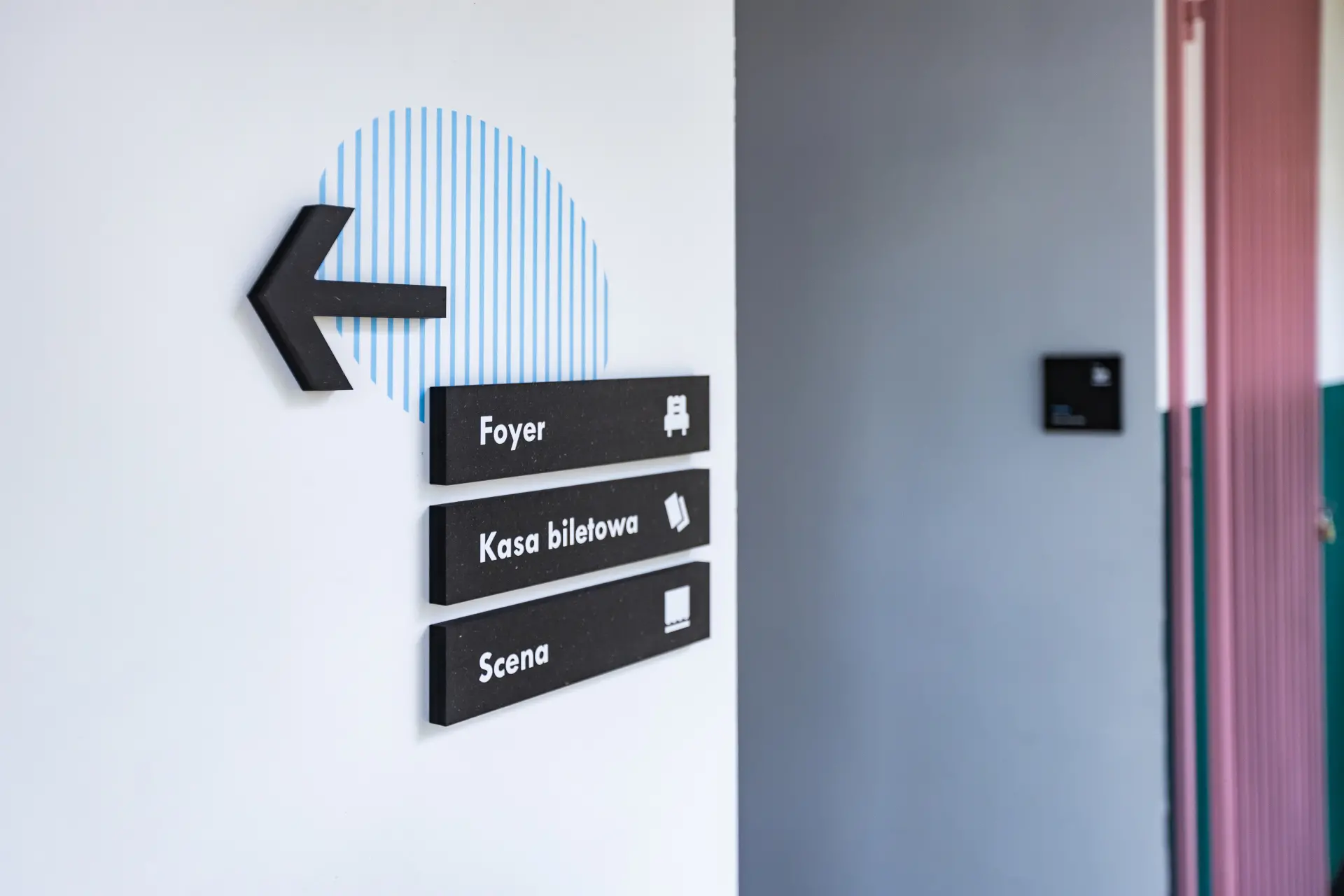
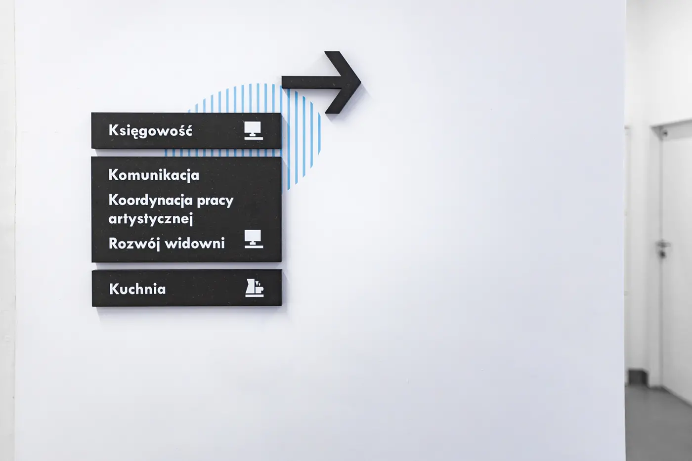
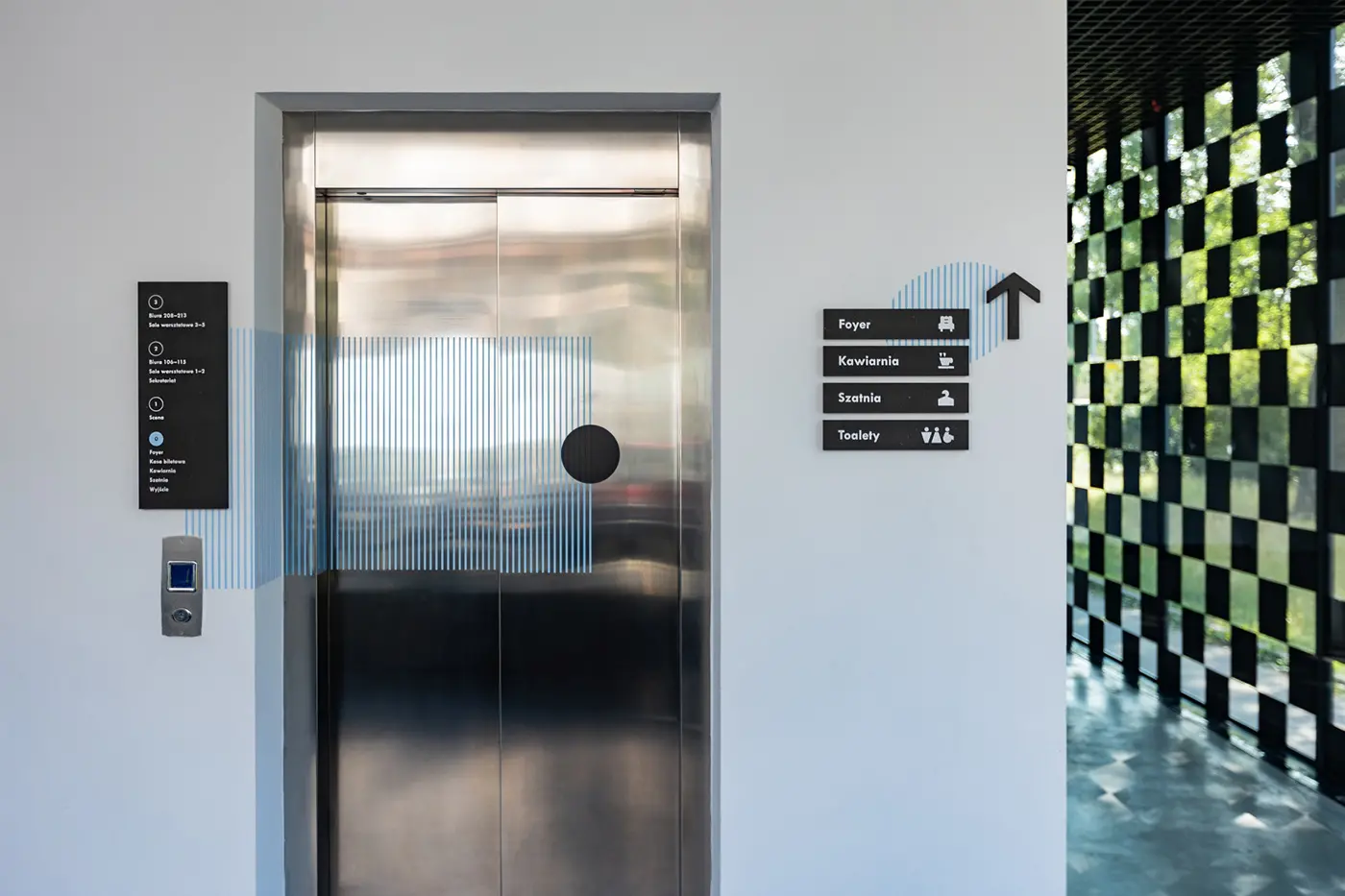
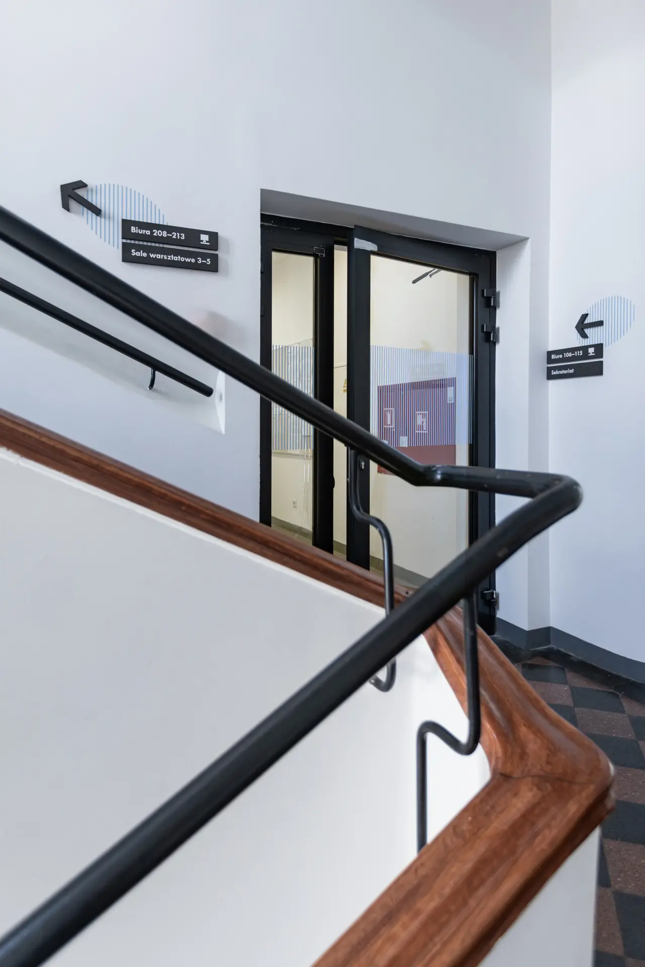
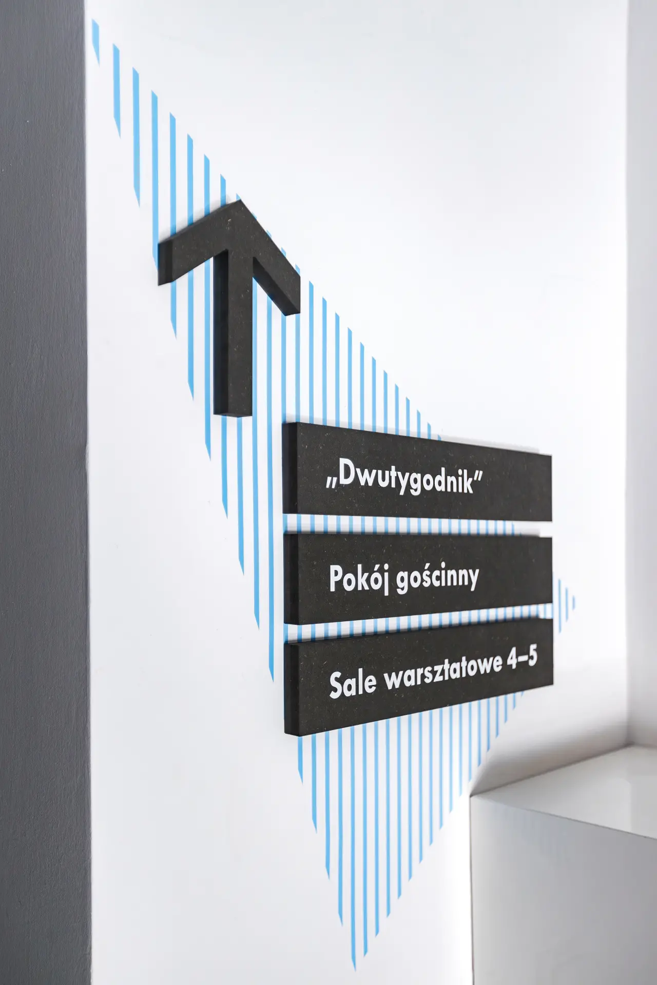
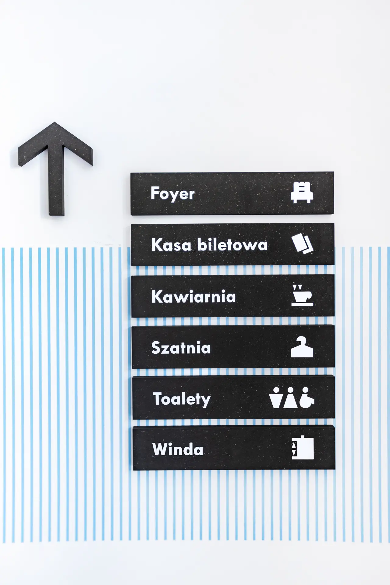
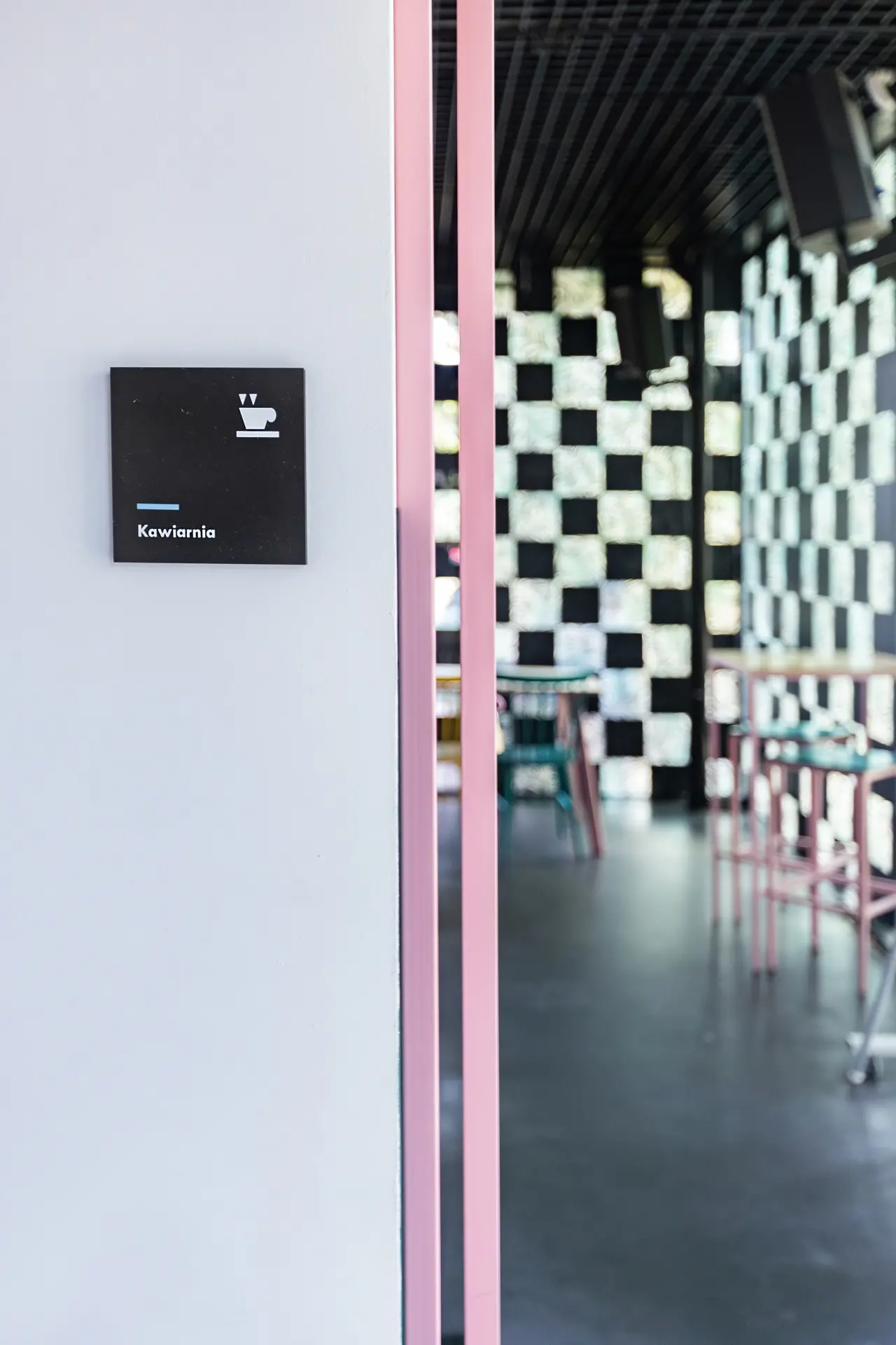
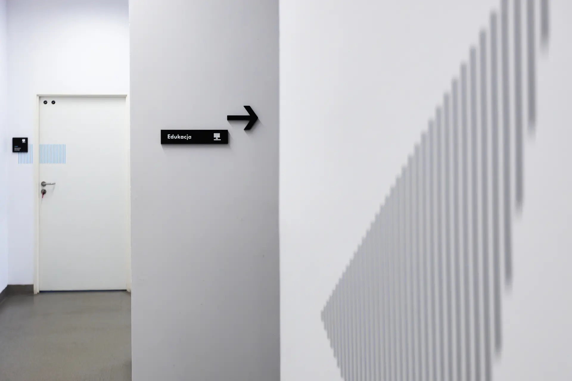
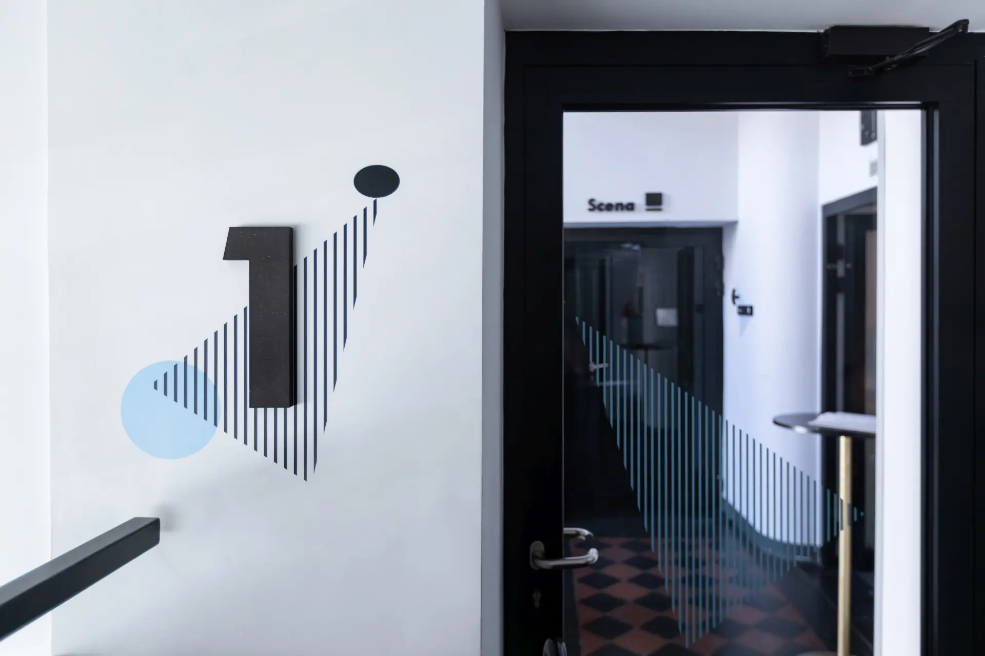
The wayfinding system prepared by us for the Teatr Ochoty, one of the smallest city theatres in Warsaw – a place of debut for young artists, theatre education and artistic exploration.
Implementing coherent signage in a public institution whose position and visual image are already well-established among audiences is a task that requires empathy and focus on the values that guide the place. Currently, the Theatre is a place defined by openness and accessibility. Its graphic materials are informal in nature and closely linked to the institution’s distinctive logo.
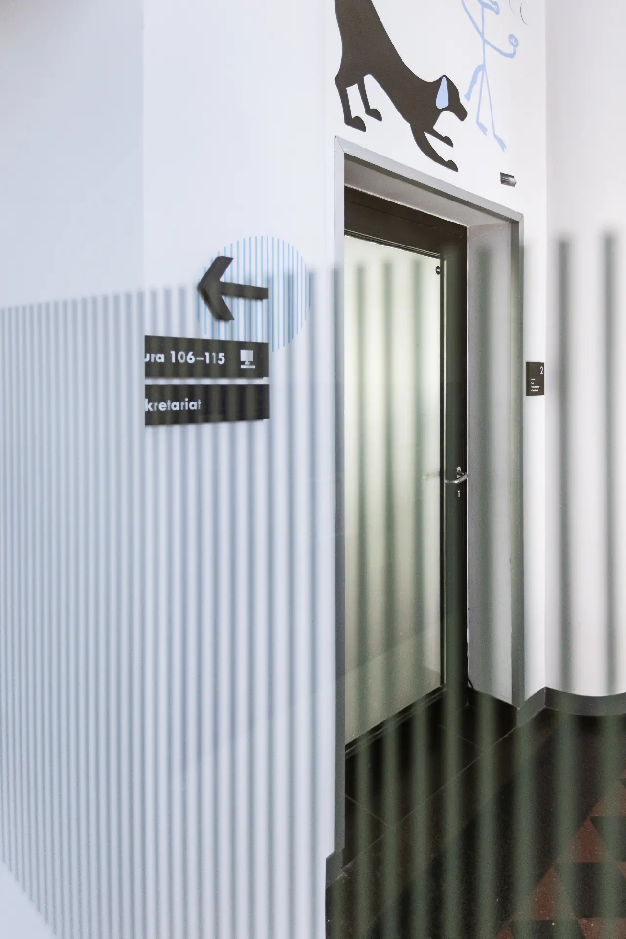
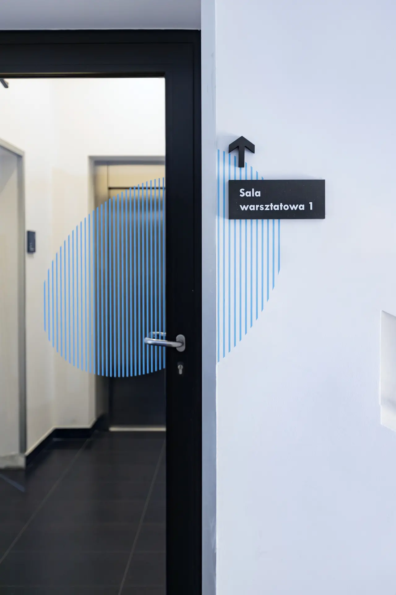
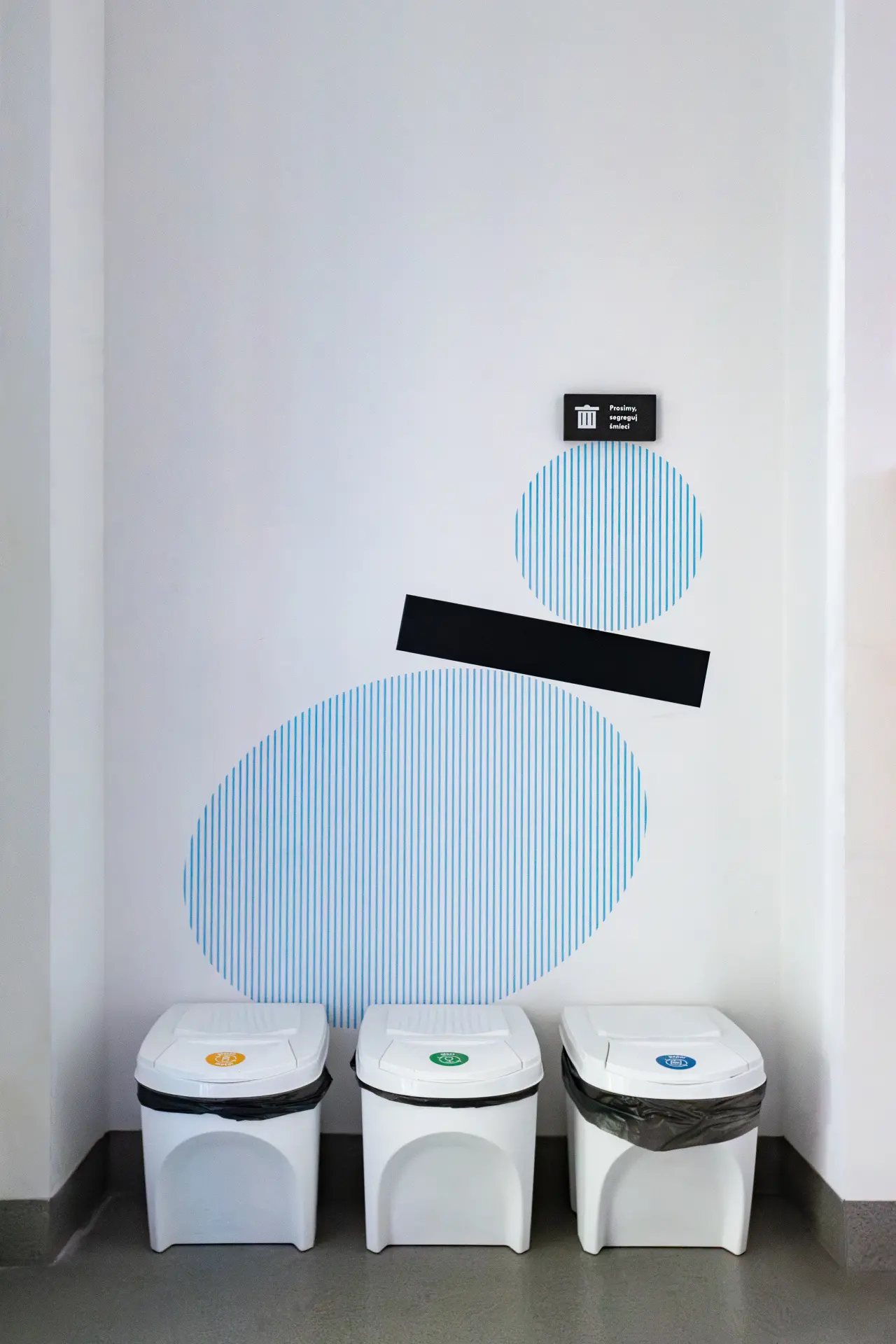
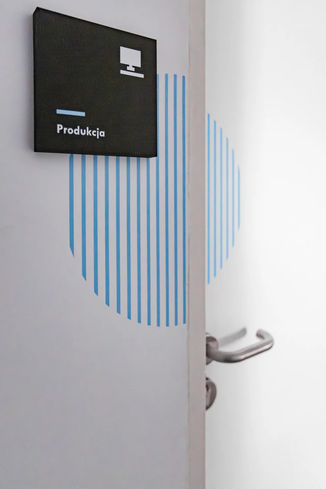
The logo of the Theatre is distinctive and well-associated by its users, hence the visual signage system is inspired by the elements that build it. The building of the institution’s headquarters is an example of architecture inscribed in the modernism period – it is therefore a great background for the geometric, minimalist compositions we created based on elements of the logo. The graphic layouts we created also allude to the mural which is located on the external wall of the theatre building – all these graphic combinations therefore contribute to the coherence of the institution’s image.
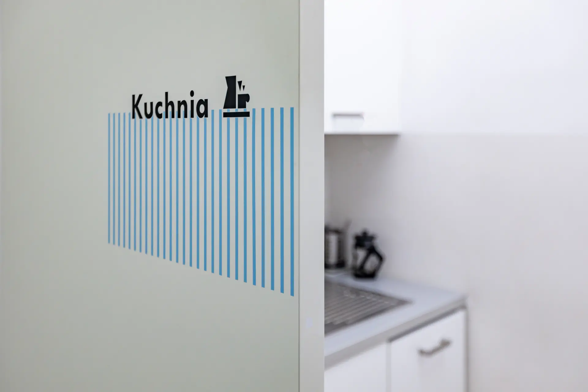
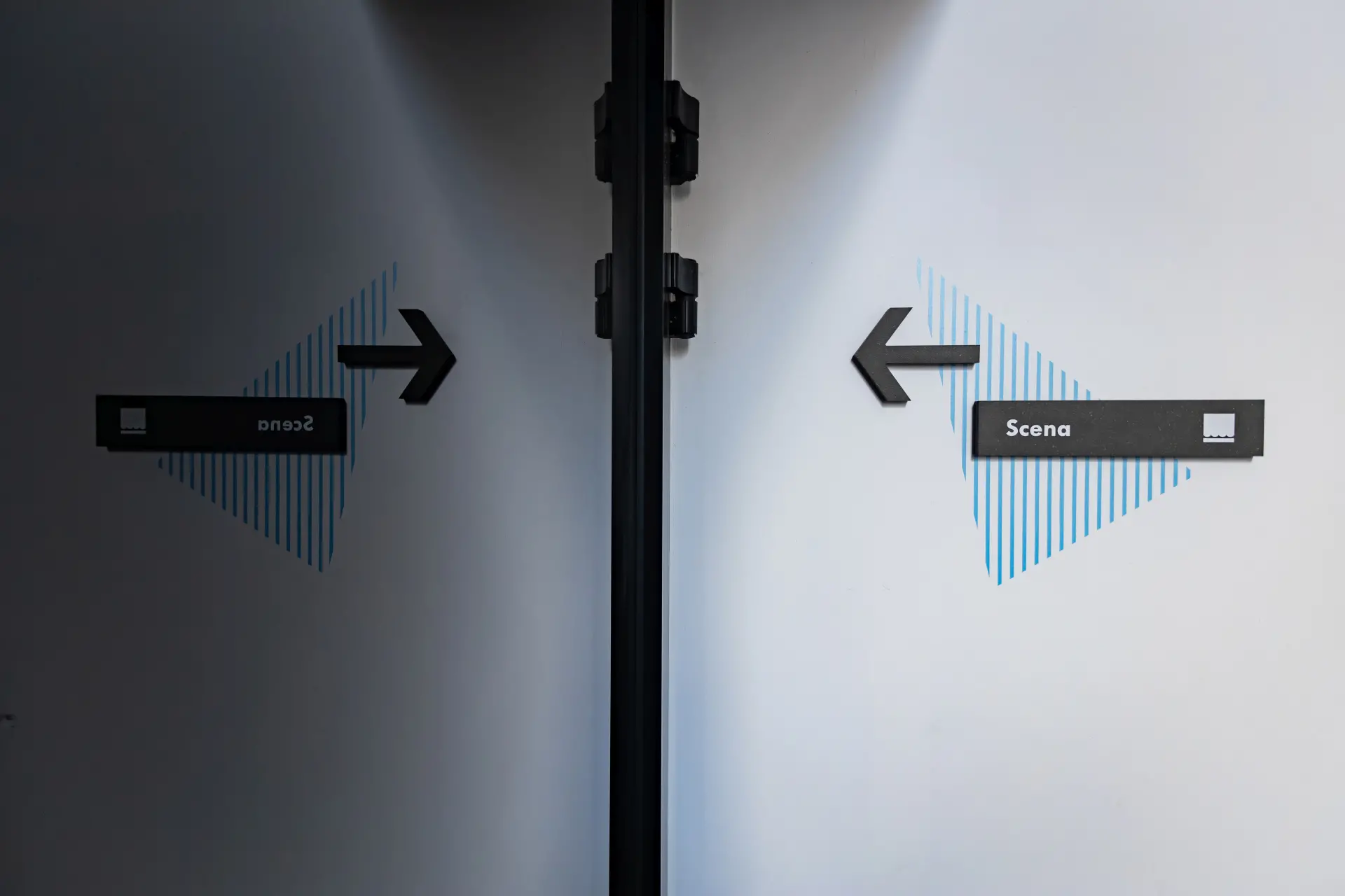
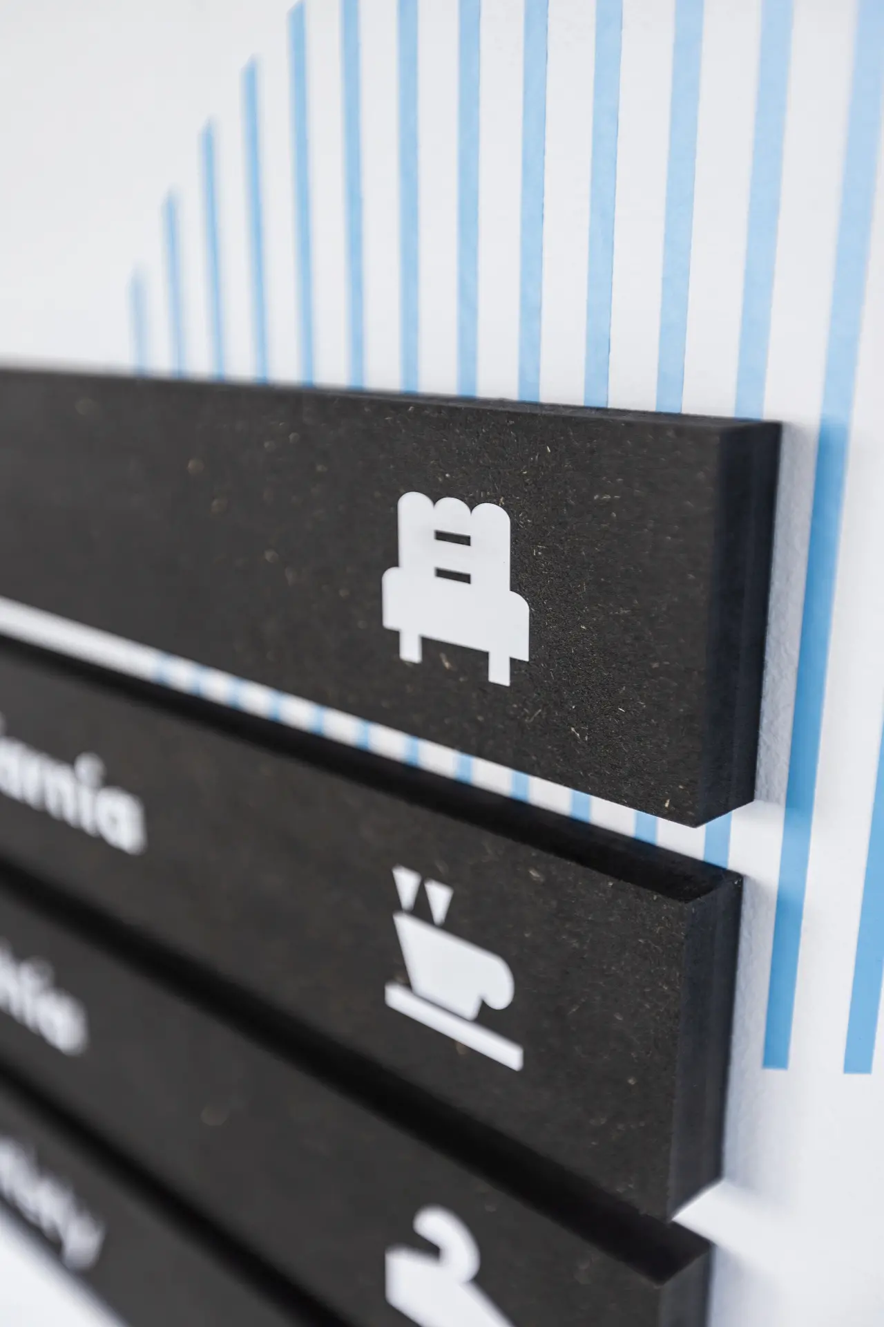
Another consideration was to adapt the design to the requirements of the planned short implementation time of the system. For this reason, the focus was on materials that are permanently available on the market (without long waits for their delivery). The design of the information carriers consists of spatial elements made of black MDF. It is a readily available material, which allowed the project to be implemented quickly. The text information on the carriers (in white) was printed or sticked directly onto the surface of the board. Other, bigger graphics are painted directly on the wall in blue and black.
Blank Studio
Bartłomiej Witański, Aleksandra Krupa
Martyna Berger, Martyna Piątek, Dobrosława Rafalska,
Oliwia Otręba
Implementation: 2023
Photo credits: Mateusz Mioduszewski
