新宿駅東口にオープンした「北村写真機店」のアートディレクション、ロゴ、パッケージ、サイン計画を担当しました。
「主役であるカメラの邪魔をしないデザインにする」ことを念頭に置きながら、VIを考えました。
ロゴタイプ:
ロゴマークは、全体のイメージの旗頭となる重要なものだと考えて制作しました。カメラの原型であり、今回のプロジェクトのコンセプトである「カメラ・オブスクラ(ラテン語で「暗い部屋」の意味)」の図を見ると、外側から光が入りピンホールを通って内部で画像が定着する仕組みが描かれています。
この光のラインをベースにラフを描き、北村の頭文字の「K」になるのではないかと思いました。そこで、真ん中のタテ棒をレンズをイメージして少し湾曲させてマークにしました。
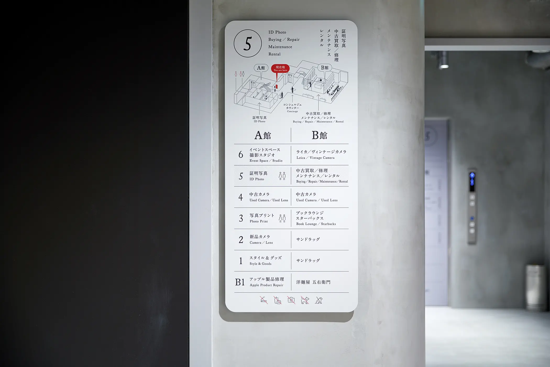
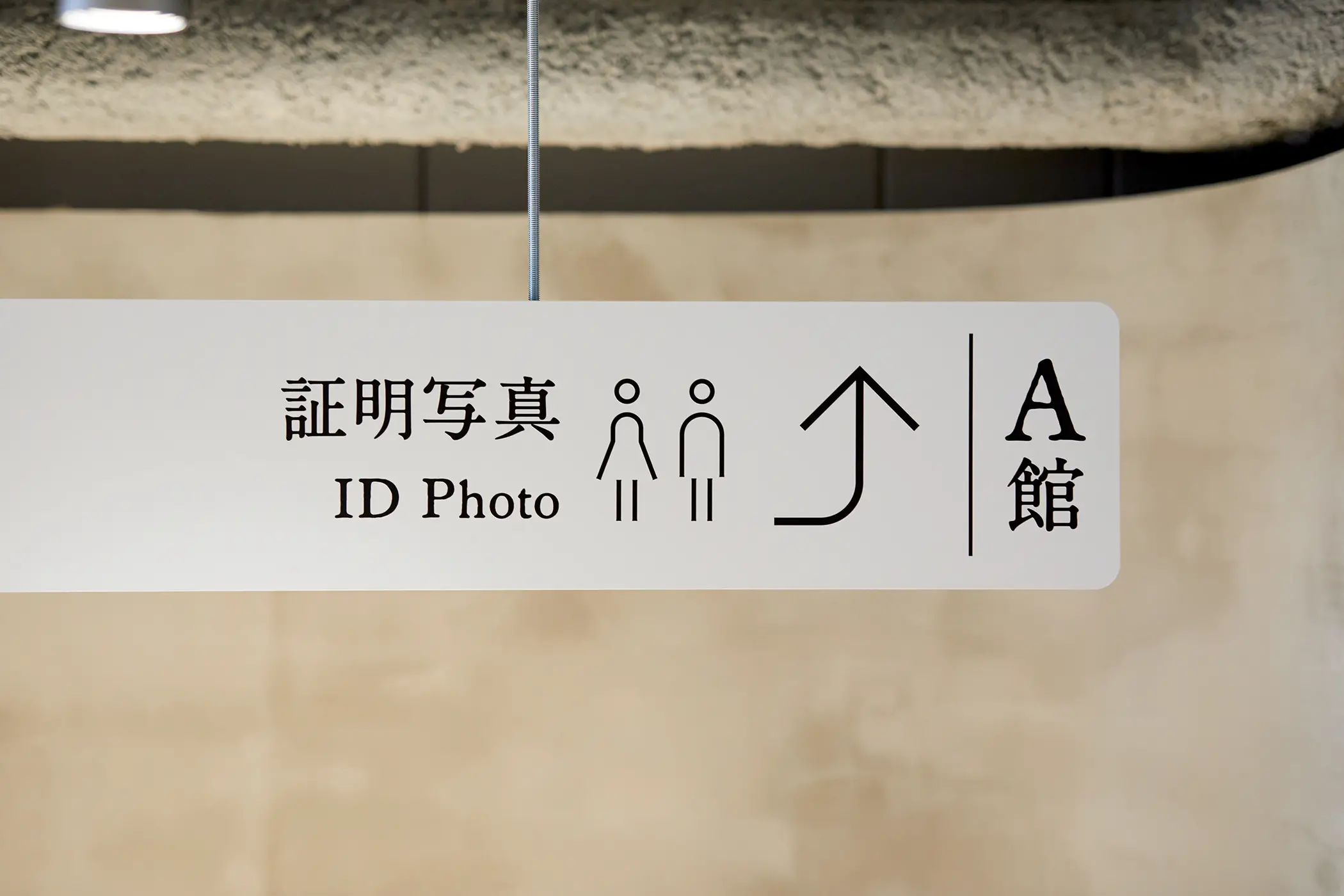
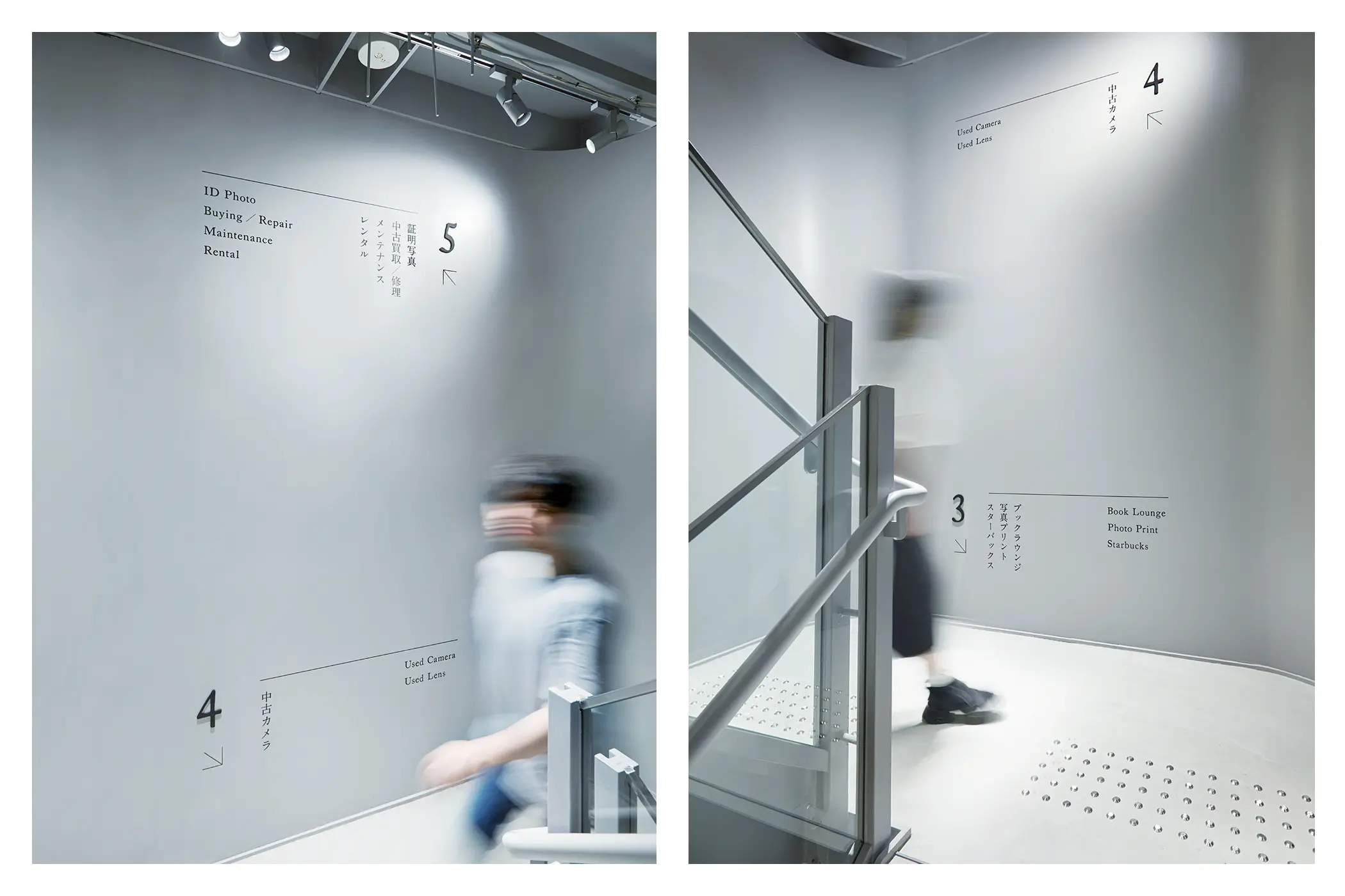
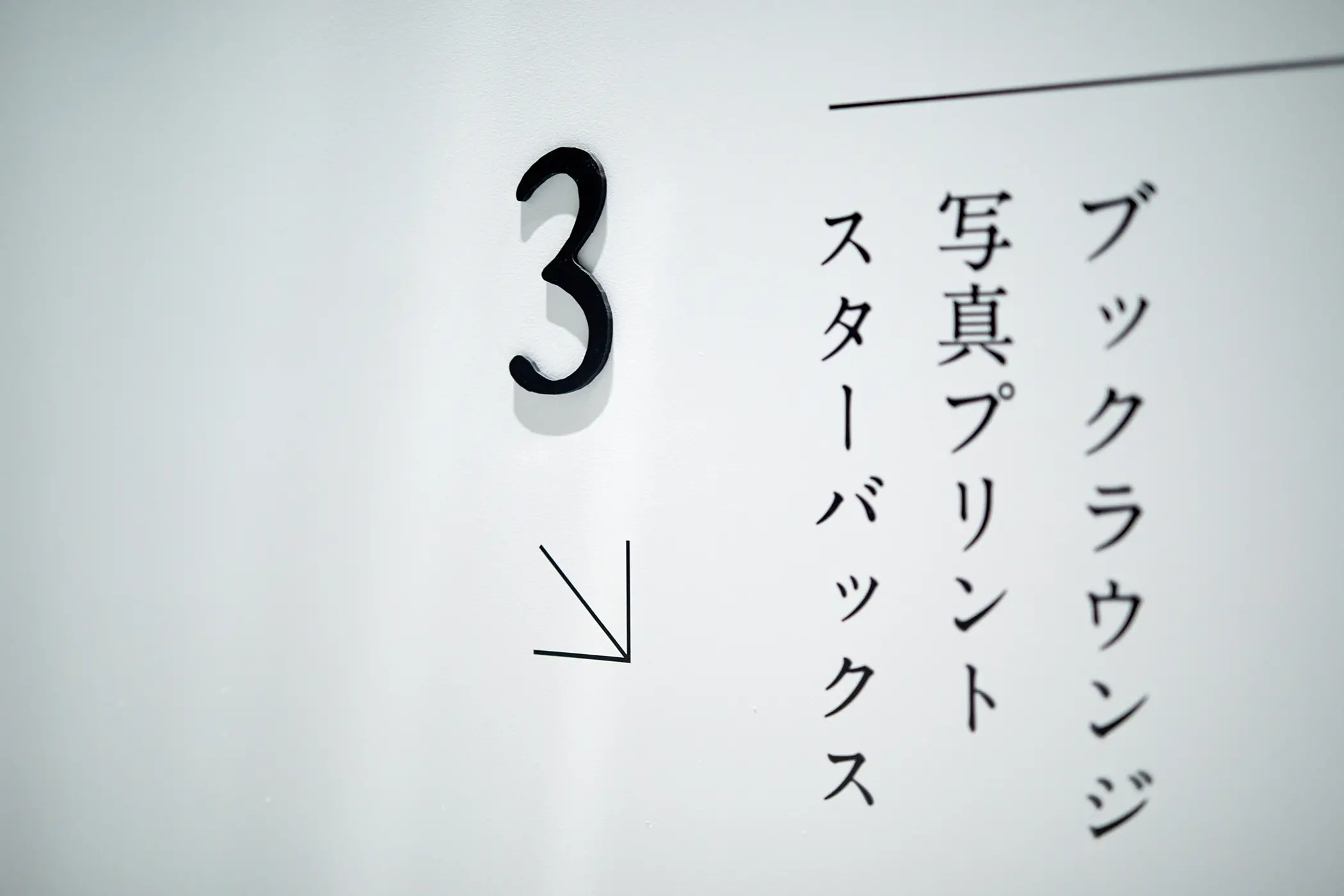
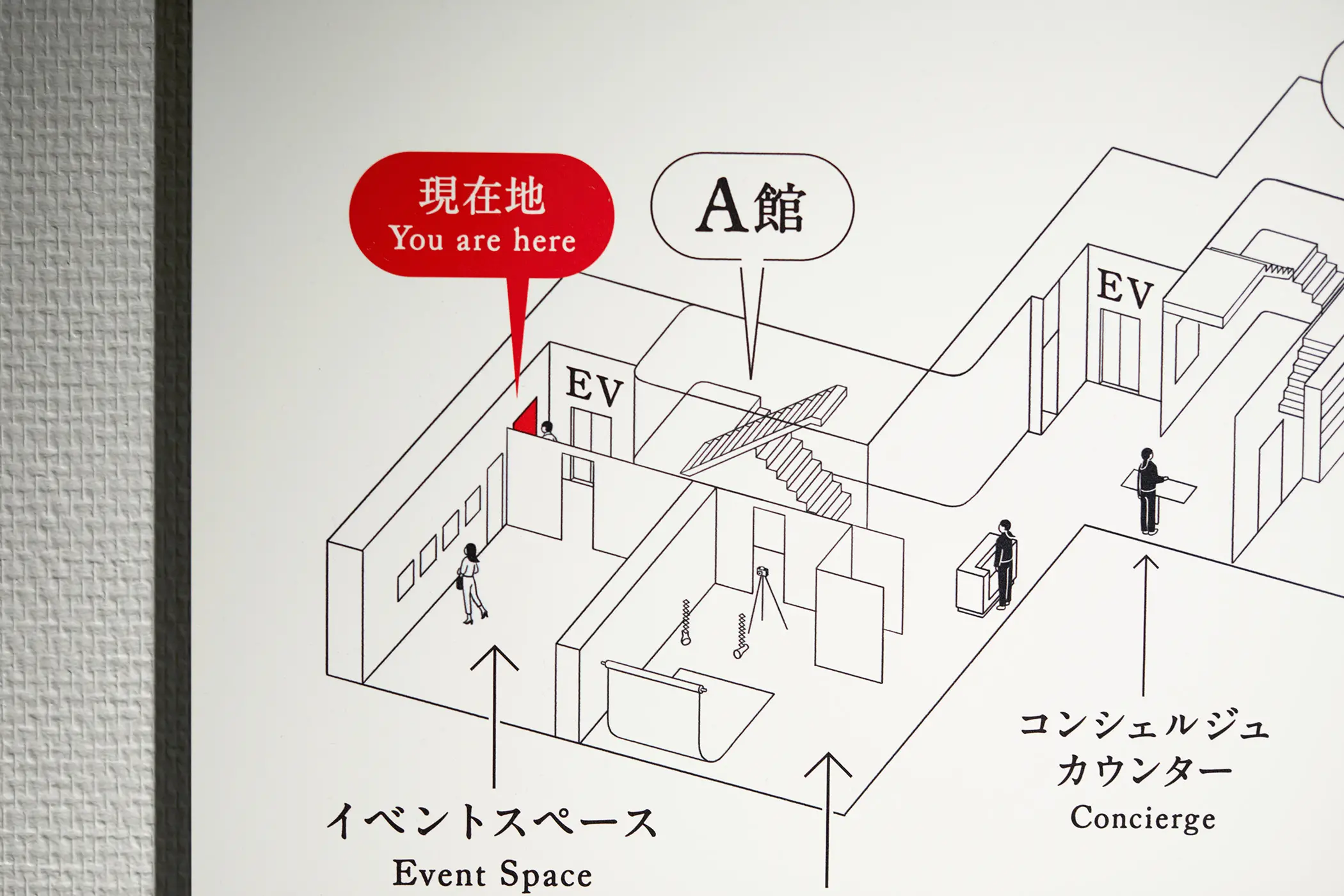
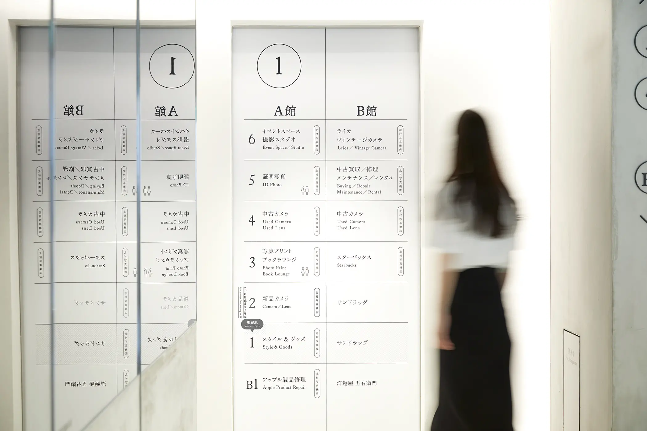
サイン計画:
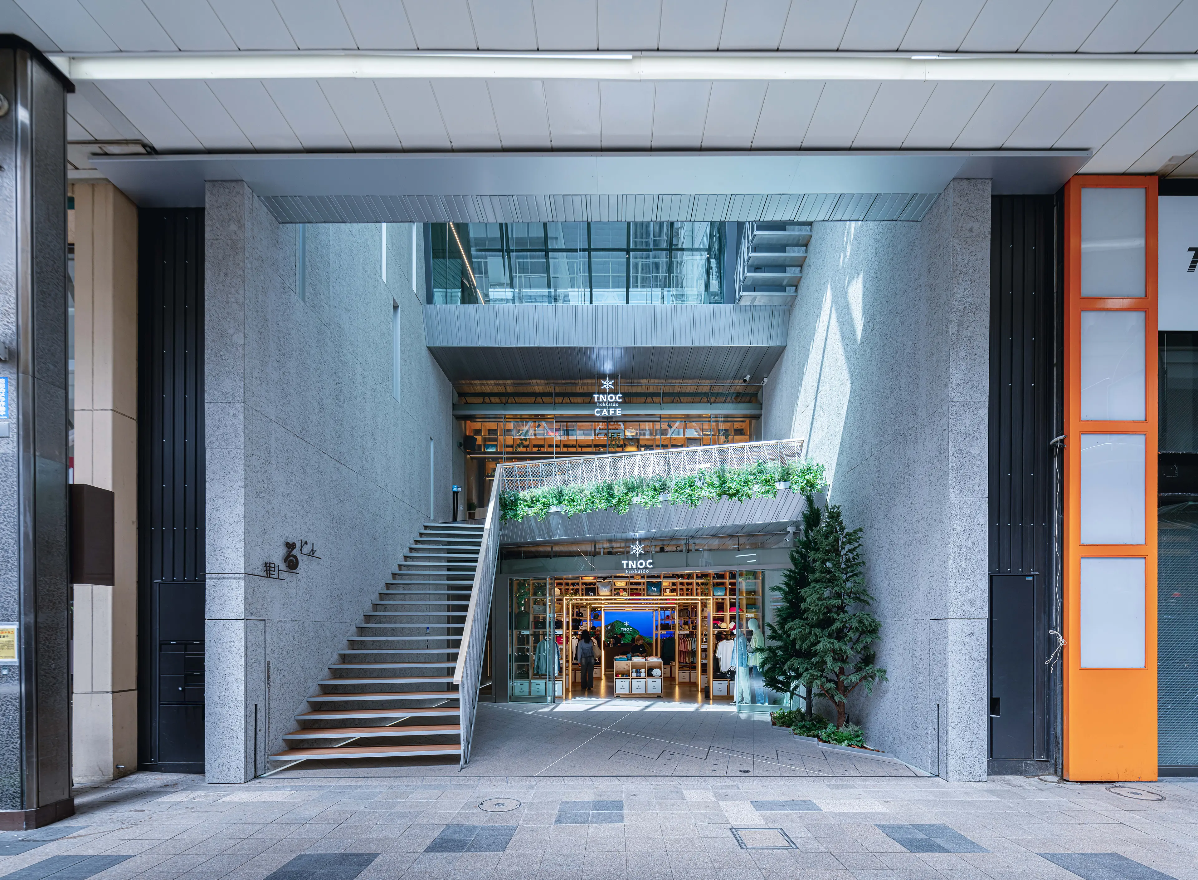
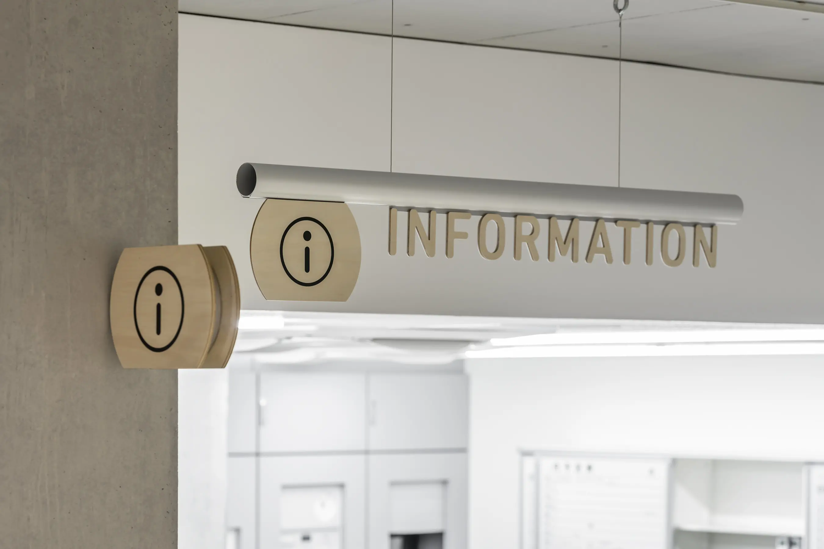
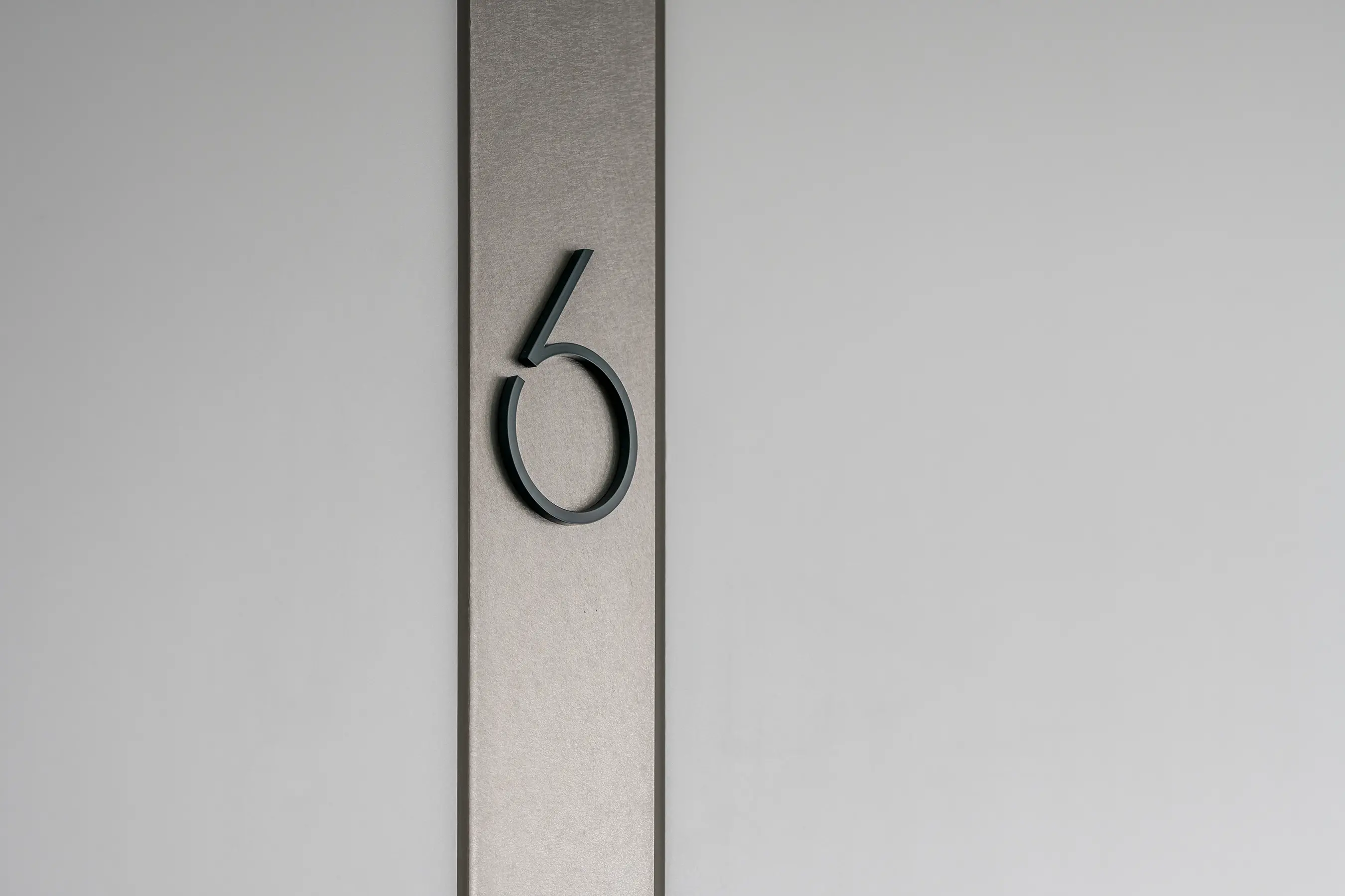
A館とB館の2棟がつながってできている建物内の、ワンフロアそれぞれが細切れになっている空間に対して、フロアによって「撮る」「残す」「治す」といった、店舗の形態が異なる複雑な構成になっている構造を整理するようにサイン計画を考えました。
1階には全フロア分のマップを置き、そのほかのサインもエレベーターの扉や、階段をあがった目線の先など目にとまる場所に置くことで、空間の邪魔をせず、かつ目的地にスムーズにたどりつけるように工夫しています。
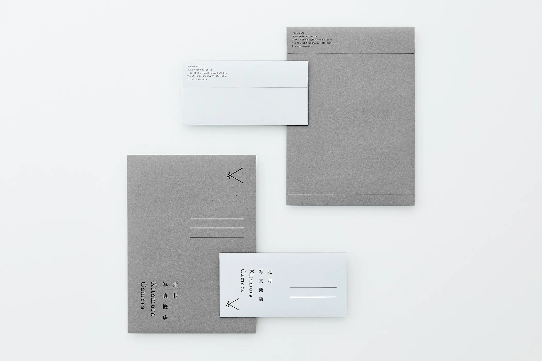
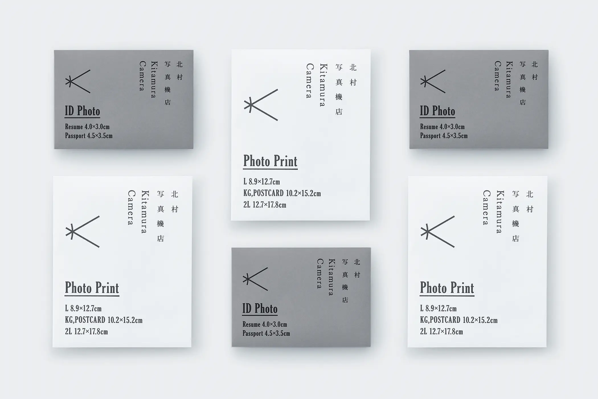
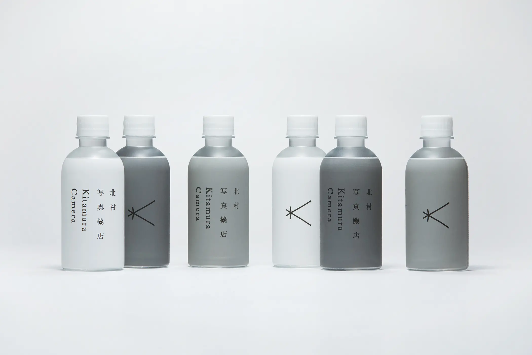
ショップアプリケーション:
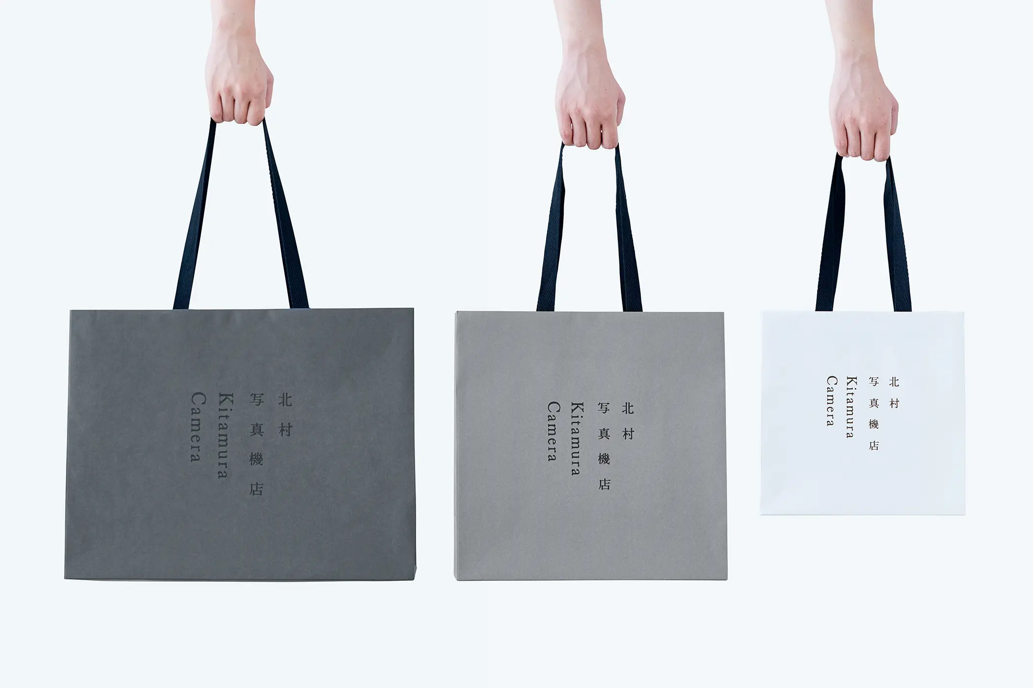
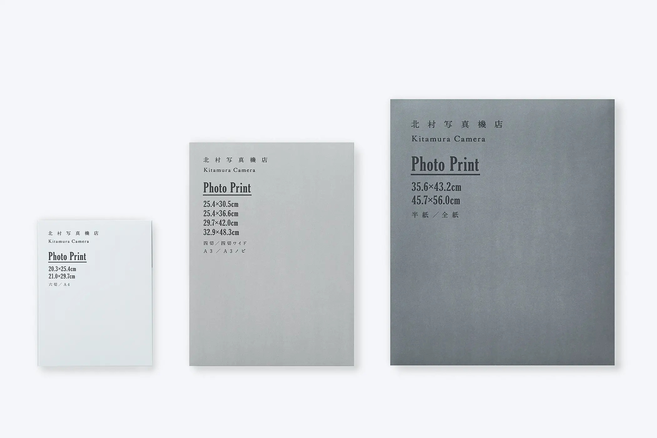
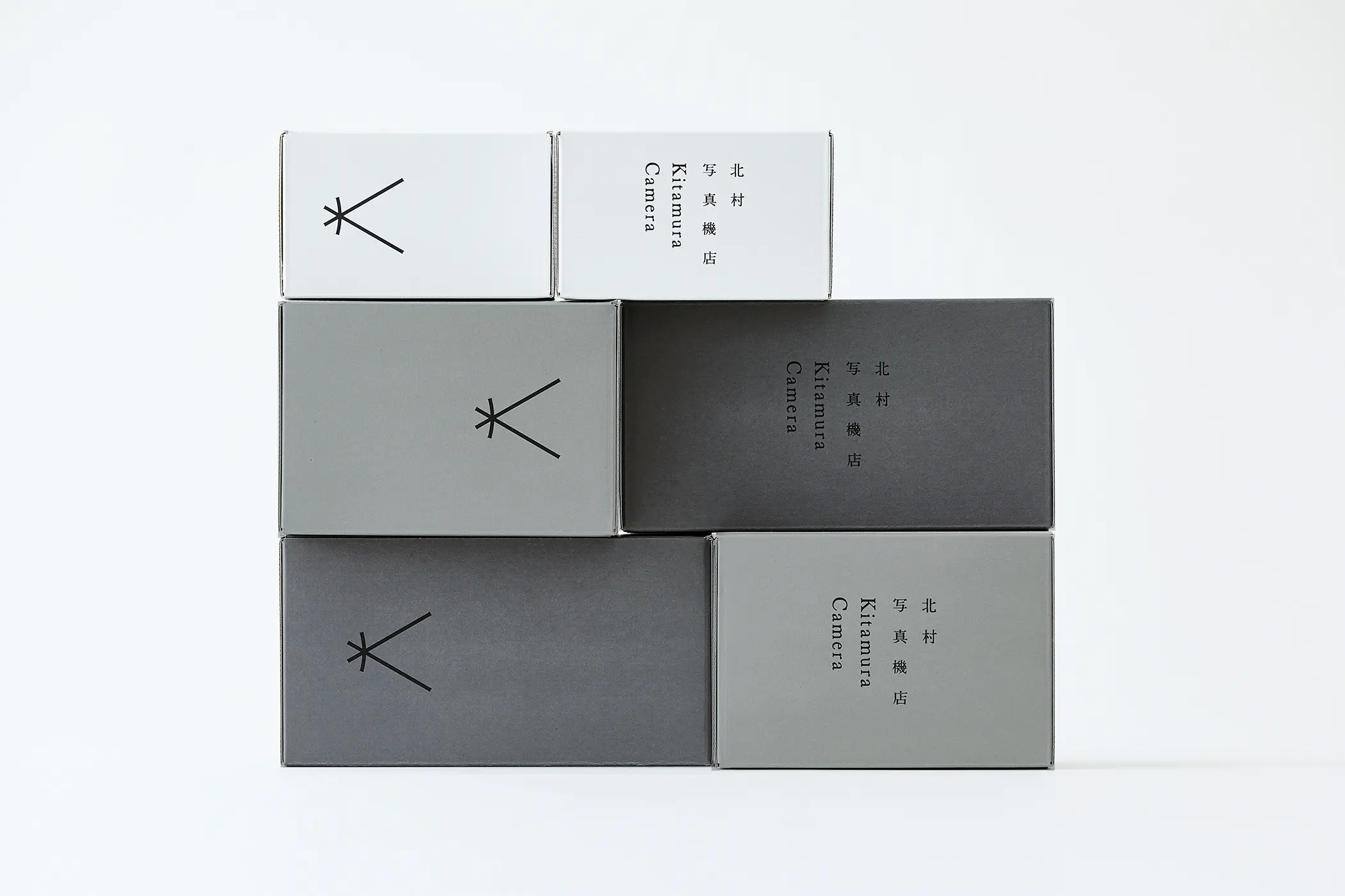
TONERICO: INCによるデザインである空間のキーカラーであるグレーをベースに、フォトケースやショッパーなどのアプリケーションを考えました。
空間を見ると、1階と2階が明るい白で、上にあがっていくとライトグレー、そしてカメラの黒という印象が残った。そこで、各アプリケーションも1色だけではなく、3色で構成することにしました。
また素材は、地券紙というグレーの再生紙を白く刷るなどして加工し、質感を高める工夫をした。
建物がざっくりとしたスケルトンの部分を見せて高級になりすぎないよう「抜け感」を出しているように、紙でも新聞紙のような素材を上品に扱い、建物をそのままデザインで表現するようなつもりで考えました。
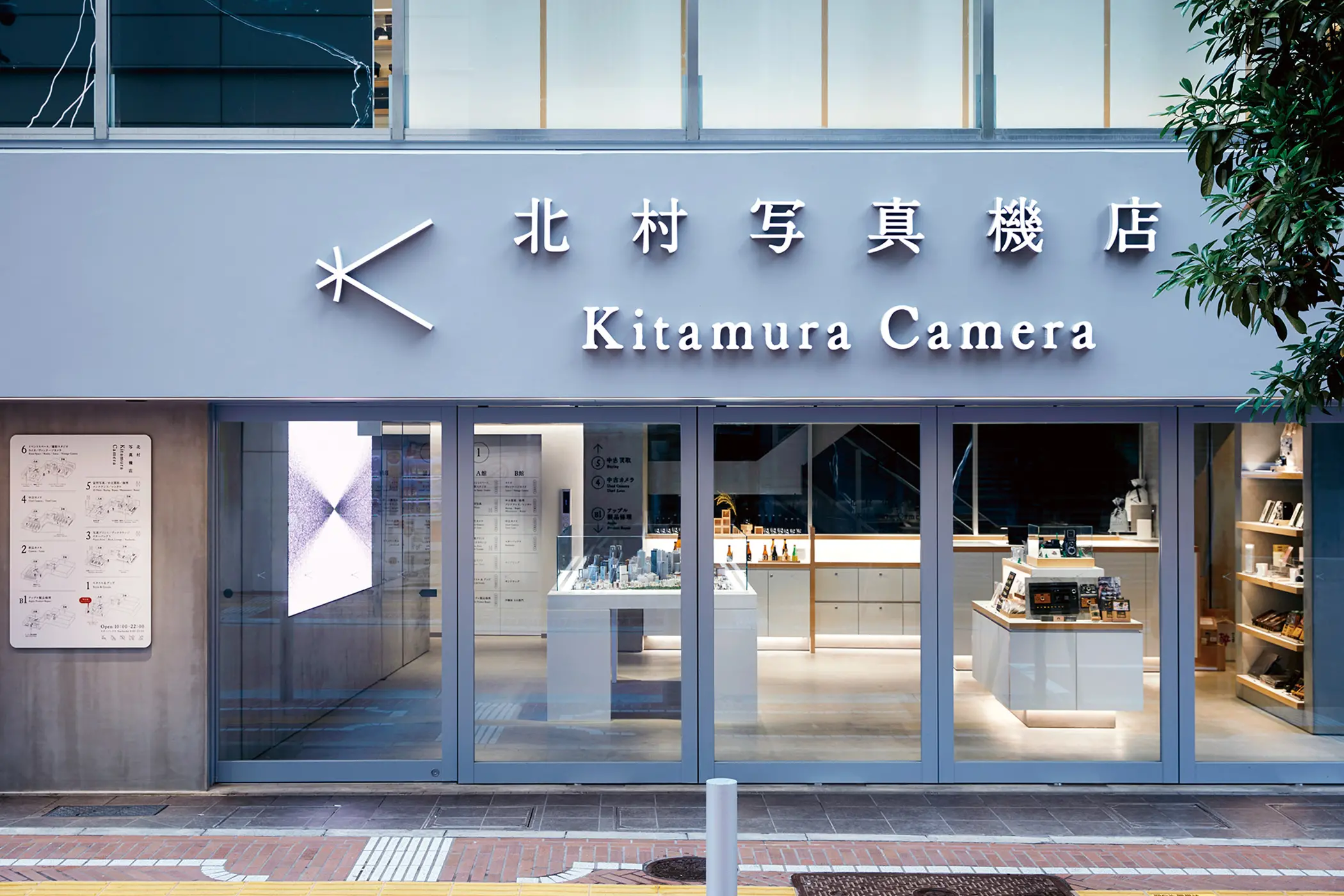
For the “Kitamura Camera Shop” which opened at the east exit of Shinjuku Station, I was appointed for its Art Direction, Logos, Packaging, and the Signage Designs.
I had thoughtfully considered its visual identity whilst bearing in mind that, “design shouldn’t interfere with the main role of a camera”.
Logotype:
The logo was created with the understanding that it would play an important role for its overall flagship image. Considering the “Camera Obscura” (or “dark room” in Latin) where light enters from the outside and through a pinhole the image is fixed within, it is the essence of a camera and the concept for this project.
I initially drew rough sketches based on the lines of light, and by bending the vertical bar a little in the middle to resemble the image of a lens, there is an overall resemblance to the letter “K” for Kitamura.
Signage:
Furthermore, the building comprising of Building A and Building B is fragmented on different floor levels, and were formatted for “collections”, “drop-offs”, and “processing” etc. Therefore a signage plan was devised to organise the various complex functions and identities within the store.
Maps displaying the functions of all floors are located on the 1st floor with further signage placed on locations which are clearly noticeable, such as the elevator doors and to lines-of-sight as you reach up the stairs. In so that all spaces can remain undisturbed, whilst maintaining smooth passage to each destination.
Shop Application:
Furthermore, the building comprising of Building A and Building B is fragmented on different floor levels, and were formatted for “collections”, “drop-offs”, and “processing” etc. Therefore a signage plan was devised to organise the various complex functions and identities within the store.
Maps displaying the functions of all floors are located on the 1st floor with further signage placed on locations which are clearly noticeable, such as the elevator doors and to lines-of-sight as you reach up the stairs. In so that all spaces can remain undisturbed, whilst maintaining smooth passage to each destination.
6D-K (木住野彰悟)负责新宿站东口开设的北村写真机店的艺术指导、标志、包装和标识规划。
我们在设计 VI 时牢记我们想要创建一个不会干扰相机(这是主角)的设计。

标志类型:
我们创建标志时认为它是作为整体图像焦点的重要元素。 如果你看一下暗箱(拉丁文的意思是“暗室”)的示意图,它是相机的原型,也是这个项目的概念,光线从外部进入并穿过针孔,将图像固定在内部。其机制如图所示。
我根据这条光线画了一个草图,认为它可能会成为北村的首字母“K”。 因此,我将中间的垂直杆稍微弯曲成类似透镜的形状,做了一个标志。
标识系统:
建筑内部由A楼和B楼两座相连的建筑组成,每一层都被分成小块,每层都有复杂的结构,有不同的商店业态,如“取”、“保存” ”和“固化”。我们设计了标牌系统来组织结构。
所有楼层的地图都放置在一楼,其他标志放置在明显的地方,例如电梯门上和楼梯顶部的视线范围内,这样它们就不会阻碍空间并帮助您到达目的地。顺利到达目的地。我正在尽我最大的努力去到达它。
店铺:
基于 TONERICO: INC 设计的空间主色灰色,我们考虑了相片盒和购物者等应用。
当我看这个空间时,给我的印象是一楼和二楼是明亮的白色,然后当你上去时,它是浅灰色,然后是相机的黑色。 因此,我们决定为每个应用程序配置三种颜色,而不是仅一种颜色。
此外,所使用的材料是称为“jikenshi”的灰色再生纸,将其印刷成白色以增强其质感。
正如建筑粗犷的骨架是为了营造一种“松散”的感觉,但又不会显得过于高端,其意图是用纸张这种类似报纸的材料,以优雅的方式来表达建筑的本来面目。是在设计里的,我考虑过。