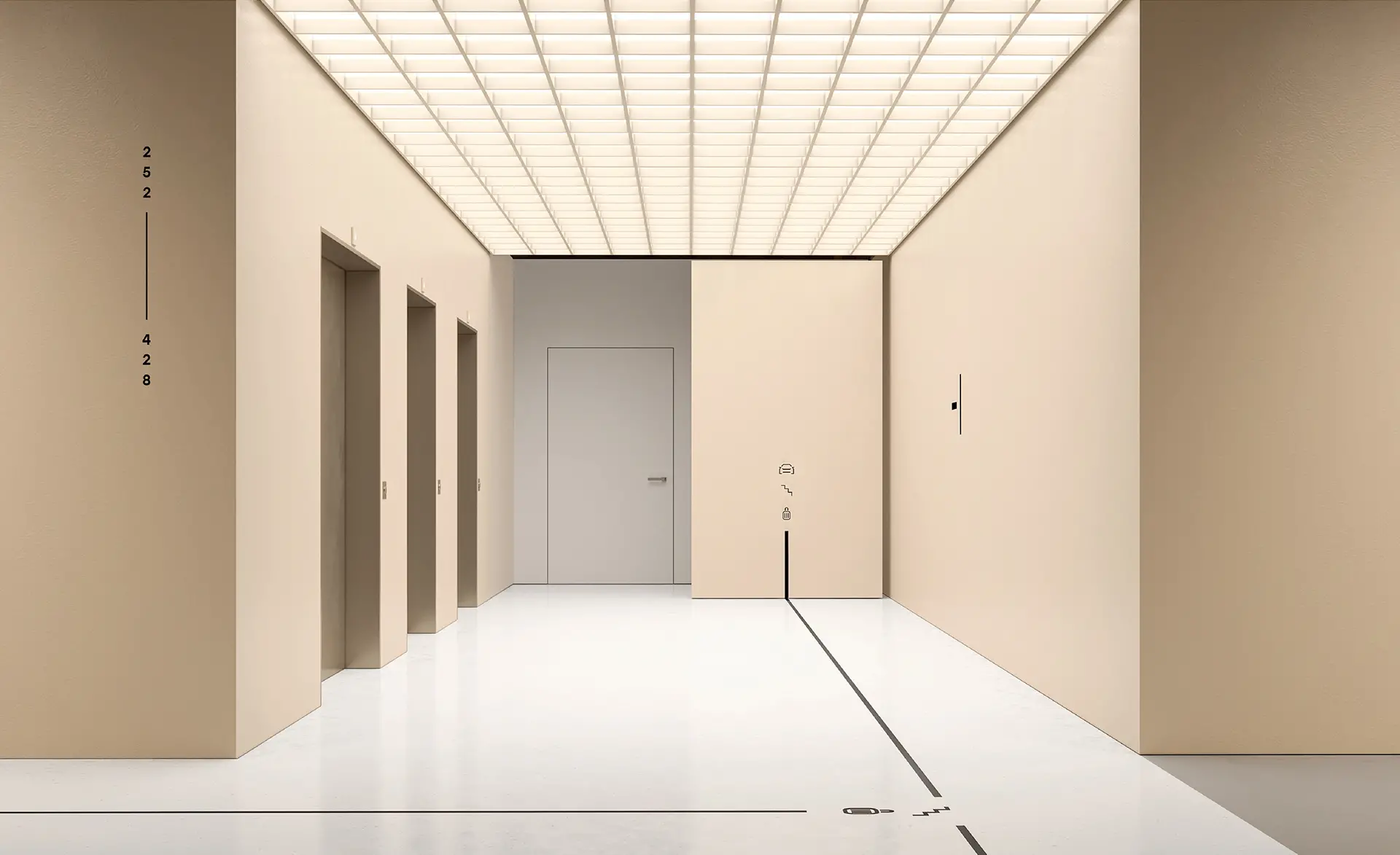
基督城机场楼停车场环境指示系统由designworks公司团队设计,大大的楼层数字和图标符号应用,让来往的旅客能够快速的识别及找到自己要前往的目的地,
除此外户外的图腾柱设计得非常漂亮,上半部分通体发光。
Research told us that people weren’t aware of all the parking options available to them at the airport. As a result, they were parking purely out of habit – often in places that didn’t fit their needs.
The existing wayfinding wasn’t helping. Thorough on-site analysis revealed that the different car parks weren’t clearly distinguished, navigation to and around the car parks was confusing and the overall experience was stressful and unpleasant.
Our solution was designed to:
1. Simplify and de-clutter the signage system to create a more intuitive experience
2. Fill in the gaps in the user journey with new and useful information
3. Create a positive and unique user experience by activating spaces
To improve the functionality of the wayfinding system, we set out to create an ultra user-friendly experience.
Our design approach was to make the functional ‘graphic’, so whether it was a directional arrow, an elevator sign or a pay-point, we super-sized everything to create a really graphic but functional experience.
In addition, we used colour and ambient graphics inspired by different aspects of the South Island landscape to give each car park a distinctive identity.


