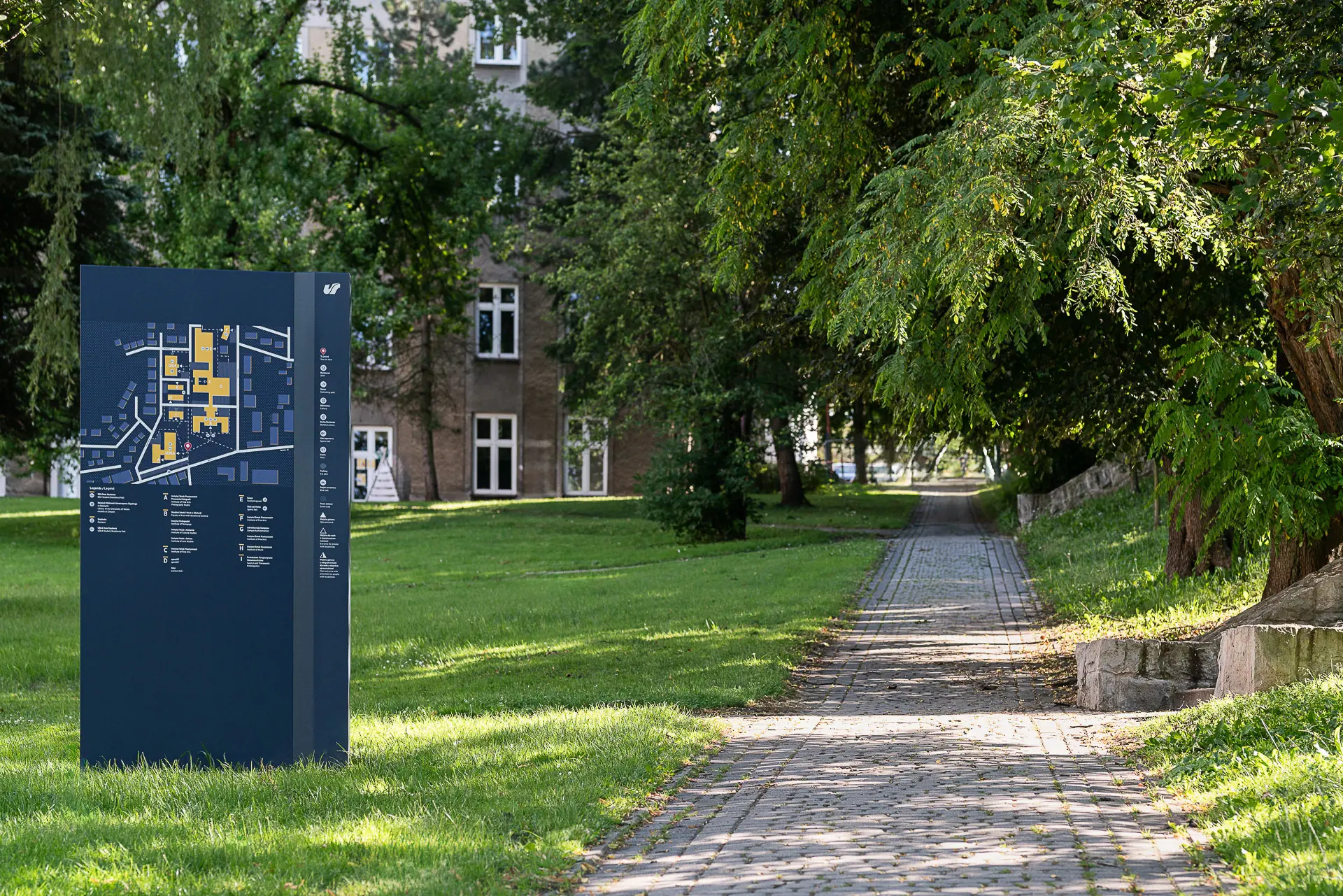
With the merger of the two student organisations SiO and OAS in 2011, the number of owned properties and members increased greatly for the new merged organisation, Studentsamskipnaden i Oslo og Akershus, or SiO for short. If you offer a good range of welfare offerings, it is essential that users are able to locate them. Good signage is therefore critical when more than 60,000 SiO users move between reading rooms, canteens, sports centres and housing facilities. Many of the student dorms are not situated on campus but spread throughout the city. Moreover, a good number of students also come to Oslo from other places in Norway or from abroad, and getting adjusted in a new city may be a bit of a challenge. SiO’s purpose is to provide a safe haven with a broad band of welfare offerings. Thus, one of our main tasks was to make SiO a distinct and visual player for its users, the students.
![]()


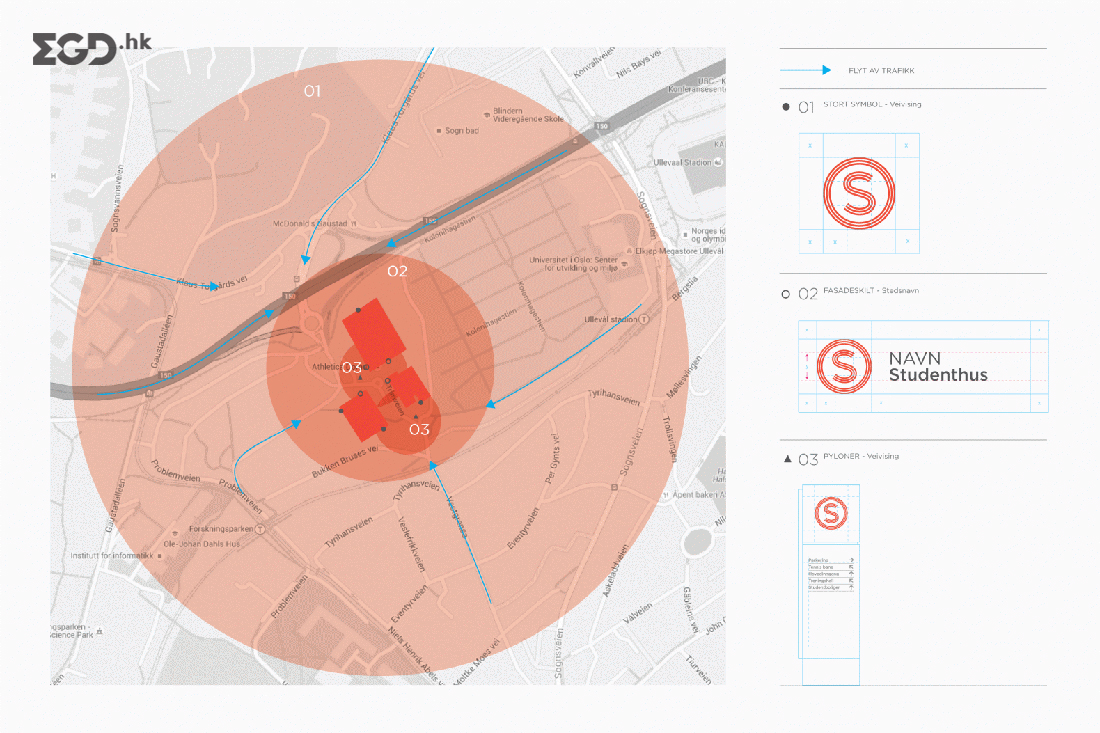
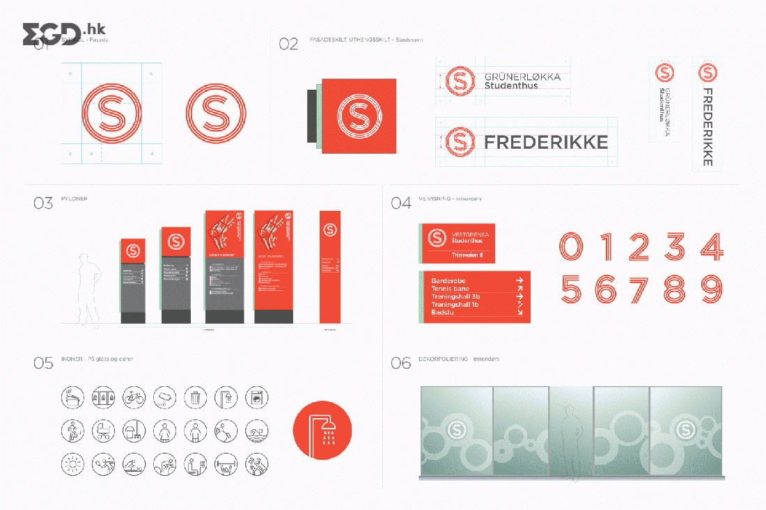
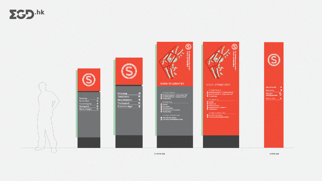
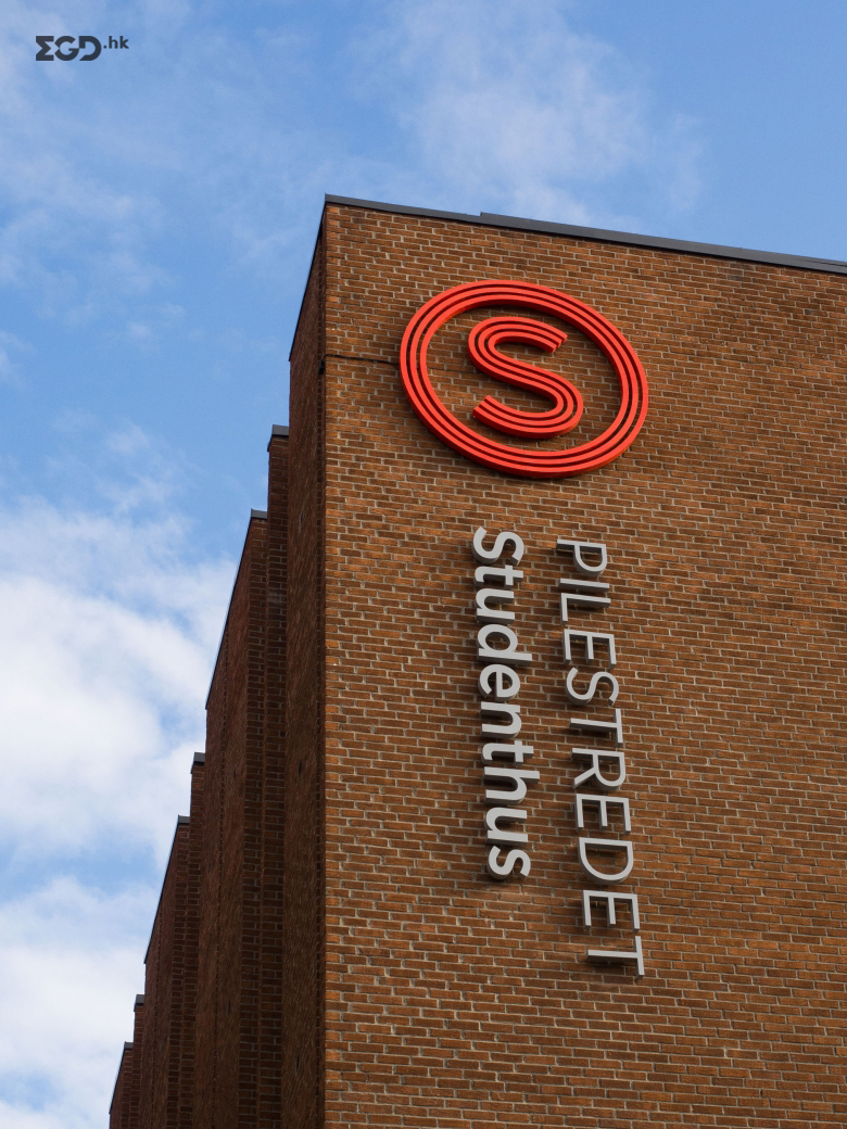
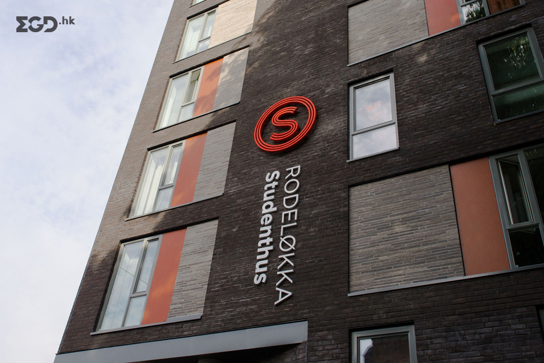
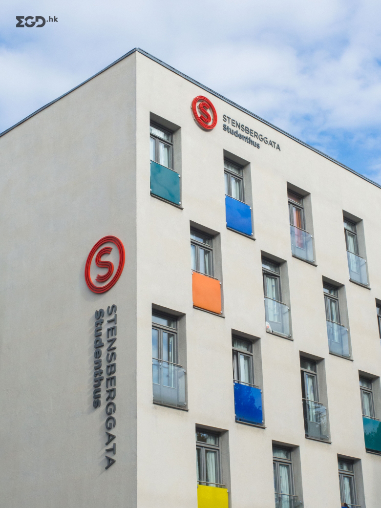
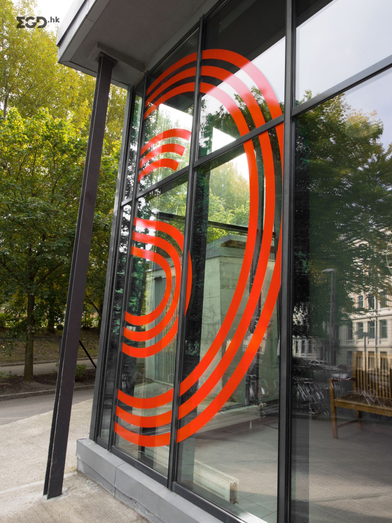
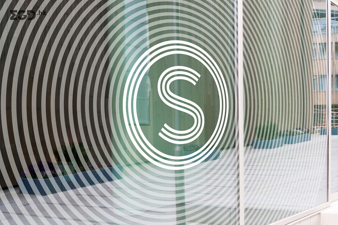
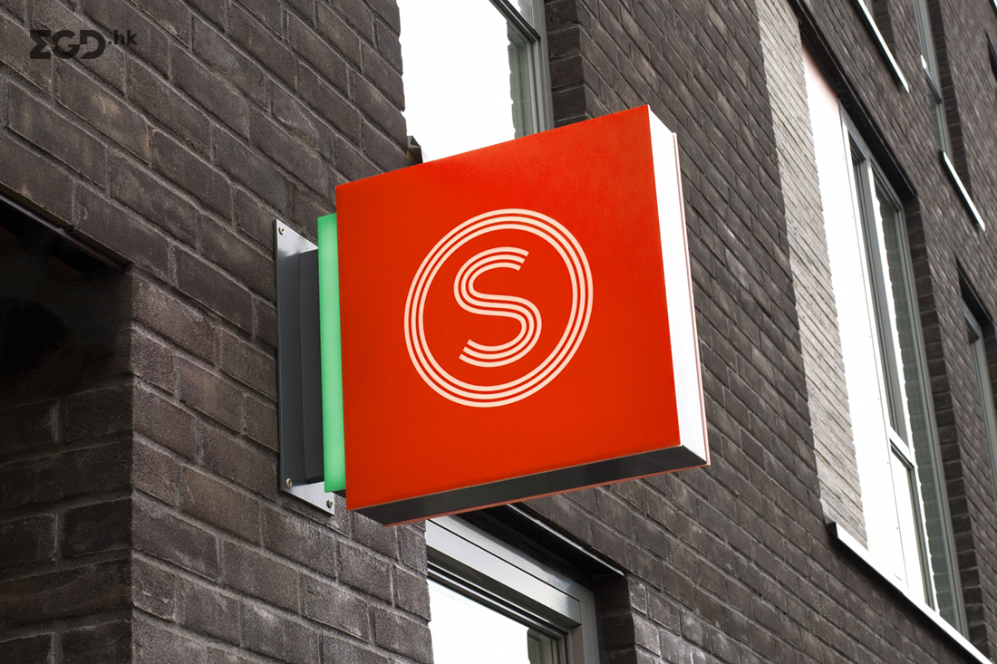
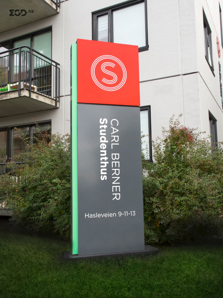
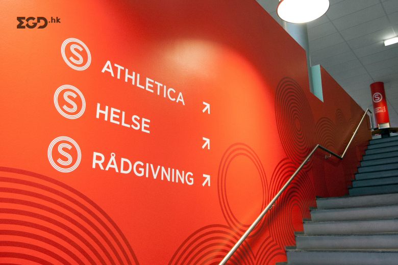
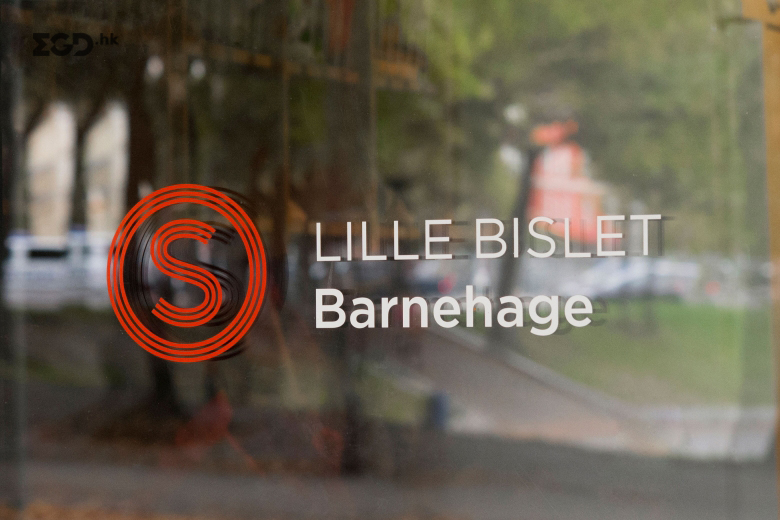
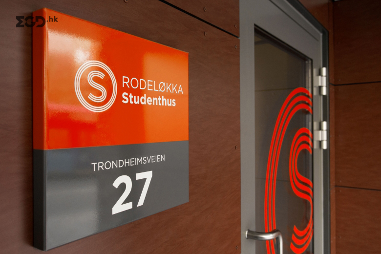
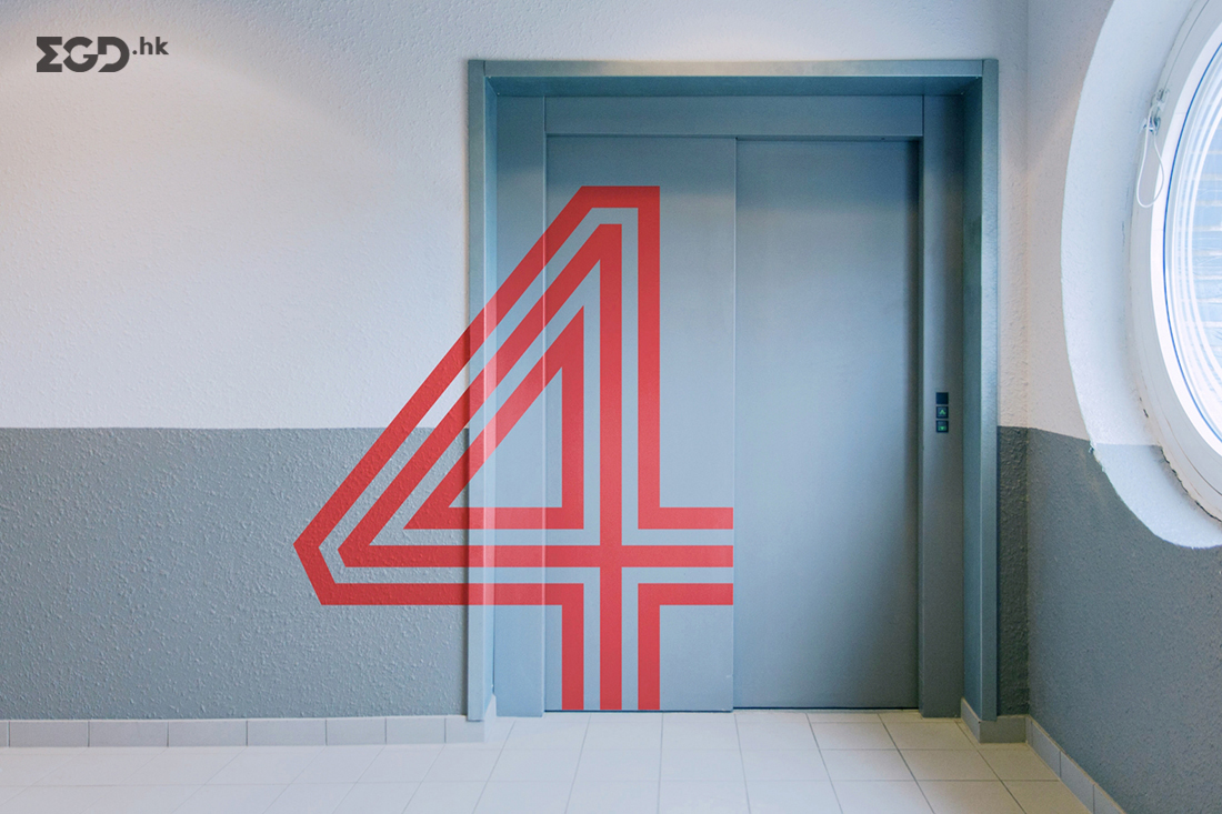
The SiO symbol puts the student at the centre, symbolically in the middle of the circle, S-i-O. With a symbol shaped as a target it works really well seen from a distance. We have developed a signage system, which bases itself on communicating distance radiuses. The highest level is the SiO symbol used on a large scale. Placed prominently high up on a building it takes ownership of that building and clearly signals ”we are here”. You may say it acts like a shining beacon amidst the confusing streets and building of the city. As you approach, facade signs will help to confirm whether or not you have reached your destination. The smaller the distance radius, the more detailed the signs are and include information about the whereabouts in the building, what floors and rooms.
Result
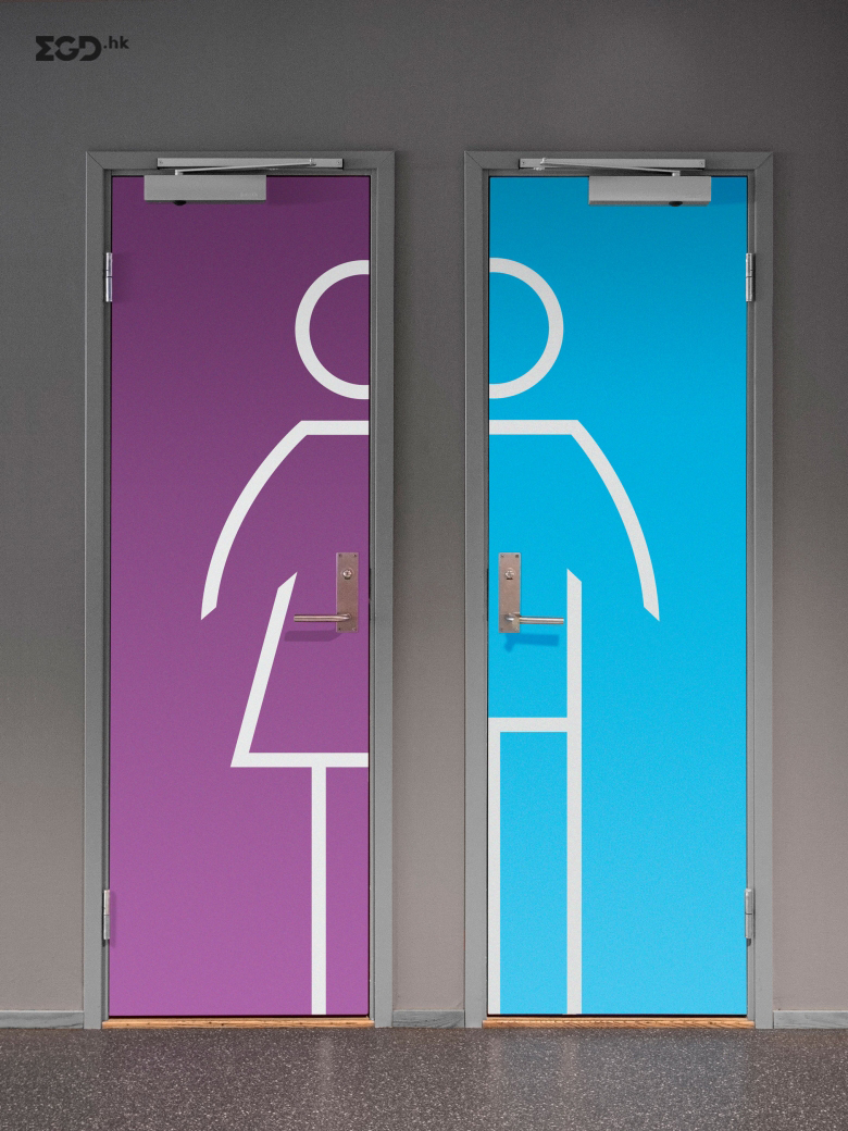
The signage system is developed with the student in mind, and to make the everyday student life a little smoother. In addition to being a pathfinder, it has also resulted in a more prominent prescence for SiO in the cityscape, and given SiO a higher degree of recognition.


